Aircraft Range Circles: What They Are and Why They're Never a Perfect Ring
Drop a range circle on most mapping tools and you get a tidy ring. Clean. Symmetric. And completely wrong. Wind at cruise altitude can shove an aircraft hundreds of nautical miles further in one direction while squeezing it back just as hard in the other. That ring should be an egg, and the egg should change shape with the seasons. Here's what a range circle actually represents, who uses them, and how Great Circle Pro builds ones that respect the atmosphere.
What is an Aircraft Range Circle?
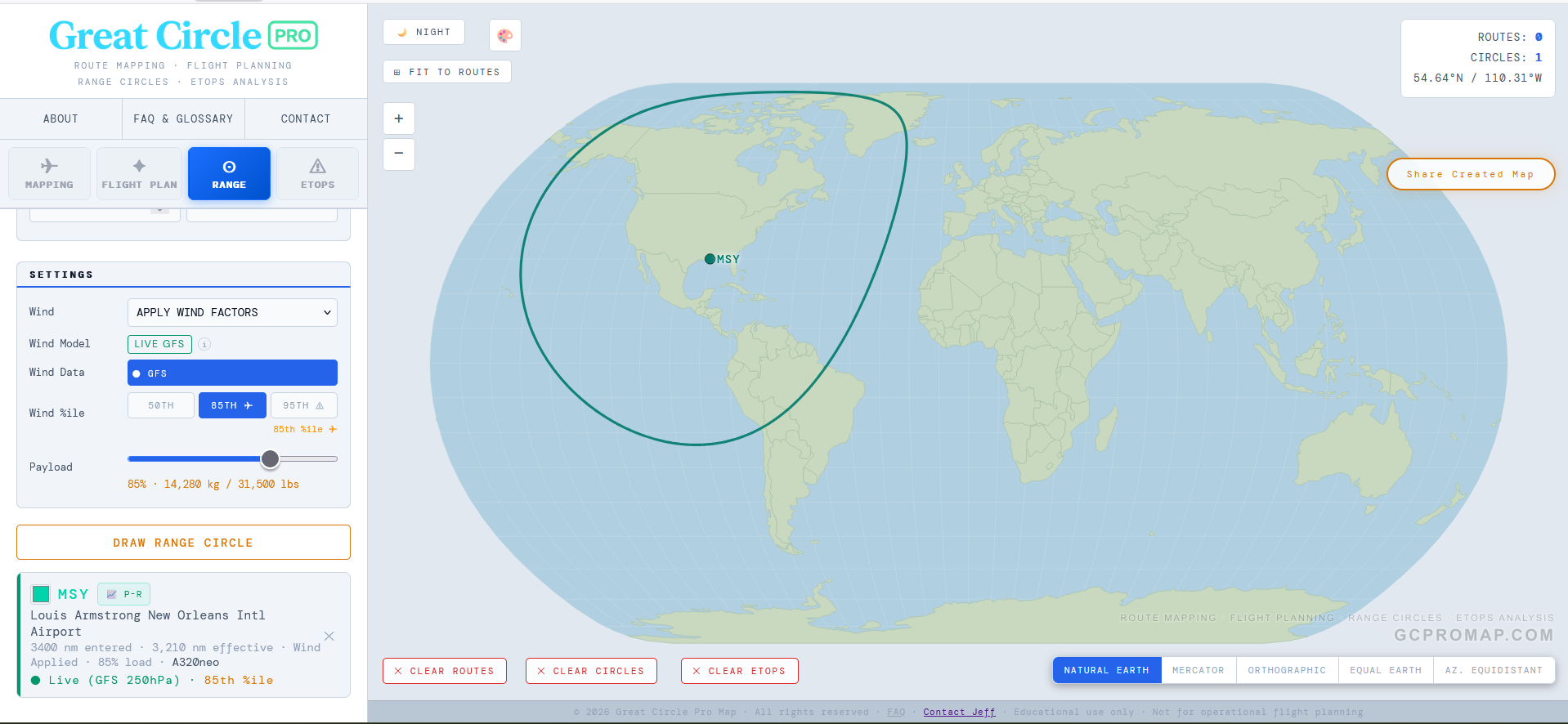
A range circle (sometimes called a range ring or range envelope) is a line drawn on a map connecting every point an aircraft can just barely reach from a given airport on a full fuel load. Everything inside the ring is reachable non-stop. Everything outside it? Time to start shopping for a connecting flight.
The simplest version is a geodesic circle: all points exactly R nautical miles from the origin, measured along the curved surface of the Earth. Think of it as tracing a compass arc on a globe rather than a flat table. On a Mercator chart it looks distorted at high latitudes, but on a globe projection centered on the departure airport, a no-wind range circle appears as a true ring.
That no-wind ring is a decent starting point and nothing more. In reality, an aircraft flying eastbound from London and one flying westbound both carry the same fuel, but they land in very different time zones. One has the jet stream pushing it along like a 120-knot hand on the tail. The other is punching straight into it, burning extra fuel for every mile. A static circle treats both of those flights identically, and that's exactly the problem wind adjustment is designed to fix.
Who Uses Range Circles and For What
Range circles show up across commercial aviation, aviation journalism, and the miles-and-points community. Each group cares about them for slightly different reasons, but the underlying question is always the same: "Can this airplane get there non-stop?"
Airline network planners
When an airline is kicking the tires on a new long-haul route, the first question is whether the iron can physically fly it non-stop at a payload that makes money (not just ferry range with an empty cabin and a prayer). A range circle centered on a hub, sized to the aircraft's range at a realistic load factor, instantly shows every city within reach. Overlay a second circle from a competitor's hub on a different aircraft type and you've got the beginnings of a network strategy conversation that used to require a room full of spreadsheets.
Aviation journalists and analysts
"Can the A350-1000 fly non-stop from New York to Sydney?" comes up every time Airbus or Boeing drops a new brochure. A range circle is the fastest way to answer it visually, showing whether the destination falls inside the envelope or just outside it, and by how much the answer changes depending on whether it's January or July.
Miles and points travelers
Many frequent flyer programs price awards by distance bands. Draw a range circle at 4,000 nautical miles from your home airport and you instantly see every destination that falls inside a given pricing tier. Very handy when you're hunting for the best redemption right at the edge of a band.
ETOPS route certification
For twin-engine aircraft flying oceanic routes, regulators require that at every point along the route the airplane can reach an adequate alternate airport within a fixed time limit, on a single engine, in worst-case headwind conditions. That diversion radius is itself a range circle, and here the accuracy of the wind model is not academic. It's regulatory. We cover ETOPS in more depth in a separate methodology piece, but the dependency on honest wind data is the same.
Why Wind Changes Everything
At cruise altitude, roughly FL340 to FL360, which corresponds to the 250 hPa pressure level, the jet stream routinely hits 100 to 150 knots across the North Atlantic and North Pacific. A widebody jet typically cruises around 490 knots true airspeed. A 120-knot tailwind is not a rounding error. It is a 25% boost to groundspeed. A 120-knot headwind the other direction is an equally painful 25% penalty. Same airplane, same fuel load, wildly different range depending on which way you point the nose.
When you apply that effect across every compass bearing from a single airport, the result is immediate and striking. The downwind lobe of the range circle stretches outward by 400 to 600 nautical miles on a strong jet stream day, while the upwind face compresses inward by a similar amount. It's no longer a circle. It becomes an asymmetric egg, with the long axis pointing downwind and a distinctive S-curve through the mid-latitudes where the jet stream core lives.
That downwind bulge is only one of two valid ways to draw the shape. Neither of the two is more correct. The other style is the conservative one: it credits no tailwind on any bearing, so instead of bulging it stays round and simply dents inward on the side facing the strongest wind, the cautious "reach it whatever the wind" view (the look you tend to see in Airbus brochure diagrams). Same physics, opposite-looking footprint, two different planning questions. Worth a caveat: there is no official Airbus-versus-Boeing standard behind these shapes. A manufacturer's brochure range is a standardized nominal figure, not a route-specific dispatch guarantee, and neither maker publishes the exact bearing-by-bearing wind method behind any one diagram, so treat the two as planning styles, not official formulas. The dent is also more obvious on shorter-range airplanes, where the wind is a bigger share of the whole leg, than on long-haul types whose routes average it out.
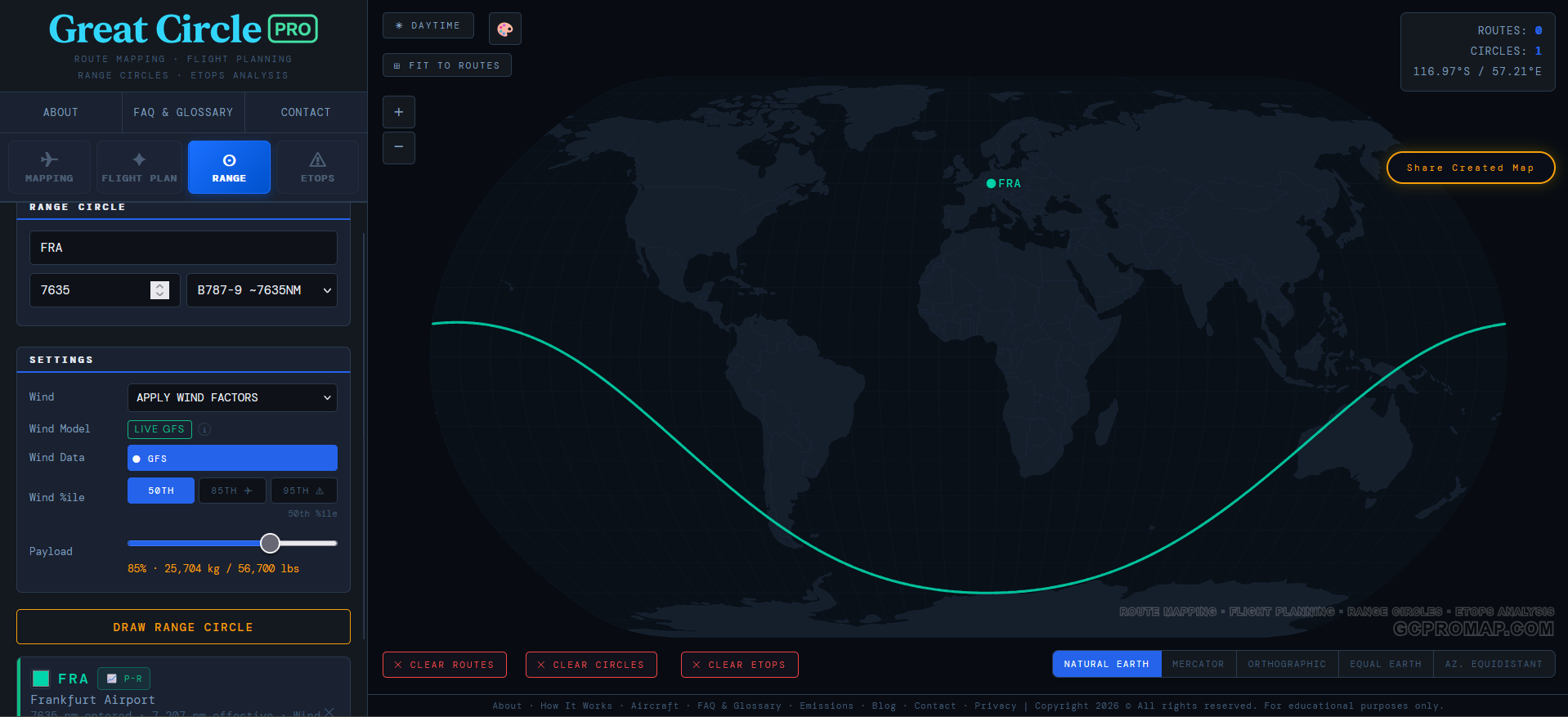
Real-world example: A 787-9 departing Frankfurt has a published range of about 7,565 nm, before route-specific payload, reserve, airport, and wind assumptions. On a strong winter westerly day the eastbound reach toward Asia can extend beyond the still-air figure, while the westbound reach toward North America compresses noticeably. On a particularly fierce jet stream day the gap between the eastern and western tips of the range envelope can exceed 800 nm. That's the difference between "Sydney is possible" and "Sydney is not even close."
How Great Circle Pro Builds Wind-Adjusted Range Circles
Every range circle on Great Circle Pro is computed from atmospheric wind data, not from a static lookup table or a single baked-in assumption. The broad strokes of how it works: instead of drawing one radius, we evaluate the wind the airplane would meet in every direction of departure, project it onto the heading to get a signed tailwind or headwind component, then adjust that direction's reach accordingly. Tailwind? The circle stretches. Headwind? It compresses. The exact sampling and weighting is our own, but the principle is simple physics.
The result is rendered as a geodesic path on the globe, a smooth, physically motivated shape that reflects how the atmosphere actually treats an airplane flying in each direction. Real atmosphere is continuous, so the contour is too: no jagged point-to-point noise, and no degenerate spikes even on a screaming 85th-percentile jet stream day. The circle might stretch and squash dramatically, but it always stays a closed, well-behaved shape. The atmosphere can be weird; the geometry stays honest.
Why 250 hPa? The 250 hPa pressure level sits in the FL340 to FL360 band, which covers the standard cruise altitude for both narrowbody and widebody jets. It's where the jet stream lives, and it's the pressure level that matters most for en-route wind planning. You could model winds at FL390 or FL280 separately, but for a planning tool that needs to work across aircraft types from a Cessna 172 to a 777-9, the 250 hPa level is the right compromise.
The Wind Data: Global Coverage, Multiple Sources
Great Circle Pro's wind model draws from global atmospheric data covering the full range of latitudes from the equator to the poles. We resolve the major features of the global circulation: the mid-latitude jet stream (the big one, the one that bends your range circle into an egg), the subtropical jet, the equatorial trade winds that blow the opposite direction, and the polar vortex winds at high latitudes. Each of these regimes has its own character. The jet stream core can top 130 knots in winter. The trades are steadier but weaker, blowing easterly at roughly 15 to 20 knots. The polar winds sit somewhere in between. The boundary between trade winds and the subtropical jet fringe isn't a hard line either, the model smoothly transitions between the two regimes between roughly 10° and 20° latitude, so a flight passing through 15° doesn't get an artificial wind cliff.
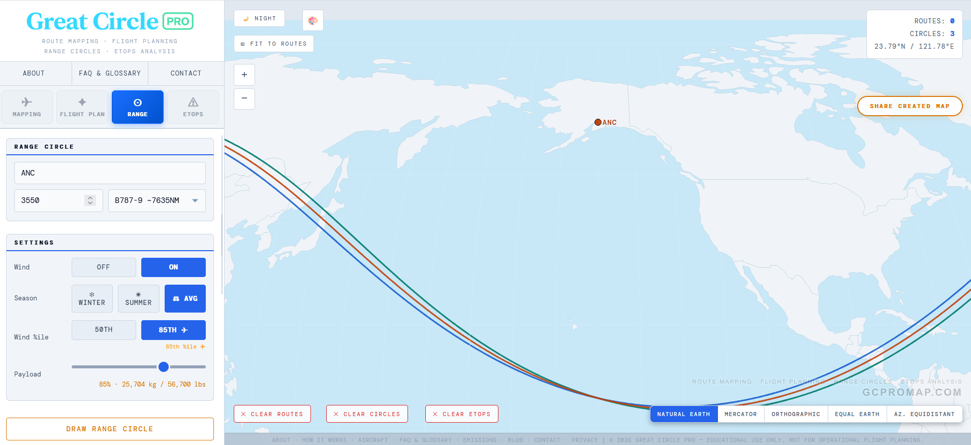
The model captures all of these regimes and interpolates smoothly between them, so a range circle from an equatorial airport like Singapore looks very different from one drawn out of Anchorage. Singapore gets a gentle easterly nudge from the trades. Anchorage gets walloped by the full force of the North Pacific jet stream, and the shape of the circle shows it.
Winter, Summer, and Average: The Season Selector
If you've ever flown westbound across the Atlantic in January and felt like the flight took approximately forever, you already understand seasonal wind variation in your bones. The jet stream is not a fixed feature. It migrates, strengthens, and weakens with the seasons. A range circle drawn in winter and one drawn in summer for the same airplane from the same airport can look surprisingly different.
Great Circle Pro gives you three climatology-based wind modes (Winter, Summer, and Average) so you can see this for yourself. They are built from long-term ERA5 reanalysis climatology, not a live forecast feed, which is what a long-range planning tool actually needs:
| Mode | Source Period | What You're Seeing |
|---|---|---|
| Winter | December through February | Peak jet stream strength. The jet core shifts equatorward and intensifies, producing the largest range asymmetry. Worst-case headwinds for westbound flights. |
| Summer | June through August | Weakened and poleward-shifted jet. The circle is more symmetric, but still visibly egg-shaped. Better westbound range, slightly less eastbound stretch. |
| Average (Avg) | Blended Winter + Summer | A balanced annual picture. Useful for year-round planning where you need a single representative envelope rather than a seasonal extreme. |
The Winter model is calibrated on the Northern Hemisphere cold-season pattern, when the polar-to-tropical temperature gradient is steepest and the jet stream is at its strongest. The Summer model reflects warm-season conditions, when the jet weakens and shifts poleward. The Average mode blends the two into a single envelope useful for annual or year-round comparisons.
Why does this matter? Because an airline evaluating a year-round route needs to know whether the airplane can make it in January, not just in July. Drawing the winter circle and the summer circle side by side instantly shows you the seasonal swing. If the destination falls inside the summer circle but outside the winter one, you have a seasonal route on your hands (or you need a bigger airplane).
Quick tip: When you first enable wind on the Range tab, the tool defaults to Avg mode. That's the best starting point for general planning. Switch to Winter when you need to stress-test a route for the toughest season, or to Summer when you're curious how much more forgiving the warm months are.
Percentile Models and Conservative Wind Planning
Knowing which season you're in is only half the story. Within any given season, wind speeds vary from day to day. Some January days the jet stream is screaming at 140 knots; other January days it is closer to 60. A range circle needs to account for this variability, and that is where the percentile model comes in. Great Circle Pro keeps the 50th percentile available as the normal-ops baseline, then lets you switch to the 85th percentile when you want a stronger adverse-wind sensitivity view.
Great Circle Pro offers two percentile settings that scale the wind grid to represent different levels of atmospheric intensity:
| Model | What It Represents | Primary Use |
|---|---|---|
| 50th %ile | Median wind speed. Conditions you'd expect on a typical day. | Day-to-day planning, block time estimates, network analysis |
| 85th %ile | Wind speed exceeded only 15% of the time. A strong but realistic jet stream day. | Conservative range analysis, ETOPS diversion planning, airline dispatch |
The percentile scaling is not a flat multiplier. It varies by latitude, because wind variability itself varies by latitude. The trade winds near the equator are remarkably consistent day to day. The mid-latitude jet stream is far more variable by comparison. Our model accounts for this so the 85th percentile circle reflects stronger winds where winds are actually variable, not just everywhere uniformly.
Why the 85th percentile is a conservative planning view
The 85th percentile is not a number someone pulled out of a hat. It is a conservative adverse-wind level used in long-range and diversion-style planning when the answer needs margin. The logic is straightforward: if you size a diversion radius to median wind, that radius will be too small on roughly half of all actual flights. That is not a comfortable failure rate when you're talking about an airplane that just lost an engine over the North Pacific.
By using the 85th percentile, the modeled diversion or range envelope is tested against stronger-than-average winds, accounting for the kind of headwind margin a single-engine diversion or marginal long-range route may need. For general route analysis rather than formal ETOPS work, the 85th percentile is still useful because it shows what an aircraft can reliably achieve, not just what it can pull off on a calm Tuesday.
50th vs 85th in practice: Draw both from the same airport and you'll see the 85th circle noticeably tighter on the upwind side. If your target destination falls comfortably inside the 85th percentile circle, that route is solid for year-round dispatch. If it only fits inside the 50th, you've got a fair-weather-only route that may not survive a strong headwind day.
How Accurate Are These Range Circles?
Accurate enough for planning and analysis. Honest enough to admit the limits.
The underlying wind data is real and global. The seasonal fields are ERA5-derived 250 hPa grids, so the model sees longitude and latitude structure rather than only a broad zonal average. The percentile scaling reflects observed wind variability by latitude band. For a planning tool, that is a serious level of fidelity.
What the model does not capture: step-climb profiles (aircraft climb in steps as they burn fuel and get lighter, rather than holding one altitude the whole way), cost index effects (airlines routinely fly slower than max-range speed to save fuel), ATC routing constraints (real oceanic tracks are never perfectly geodesic), and vertical wind shear (winds at FL350 can differ meaningfully from FL310). Published aircraft range figures also include reserve fuel, alternate fuel, and contingency allowances that no planning model replicates in full.
The result is a range circle with the right shape, the right asymmetry, and the right order of magnitude. It should be treated as a planning tool, not an operational flight release document. Nobody is filing a dispatch based on a browser tool, and we're not pretending otherwise. For network analysis, route feasibility checks, ETOPS visualization, and award travel planning, a wind-adjusted, seasonally-aware, percentile-scaled range circle is considerably more useful than any static ring you'll find elsewhere.
One cosmetic note: if you draw a range circle large enough that it crosses the antimeridian (the 180th meridian, that invisible line running through the middle of the Pacific from pole to pole), you may notice a slight visual artifact where the circle crosses the date line. This is a known quirk of projecting a closed geodesic contour across the map's edge, and it affects basically every web mapping tool that has ever tried to draw a polygon across 180 degrees longitude. The underlying geometry is correct, but the rendering has to stitch the path across the map seam, and sometimes that stitch shows. We're not thrilled about it either, but the math is honest even when the pixels aren't perfect.
How to Use Range Circles in Great Circle Pro
Open the tool, switch to the Range tab, type an airport code, and pick an aircraft from the dropdown. The aircraft library spans narrowbodies (737 MAX 8, A320neo, A220-300, A321XLR), widebodies (787-9, A330-900neo, A350-900, A350-1000, 777-9, 777-300ER), ULRs (A350-900ULR), corporate VIP variants (ACJ350-900, ACJ350-1000), freighters (A350F, 747-8F), regional jets (CRJ-900), business jets (Cessna Citation X+, CJ3+ and CJ1+, plus the HondaJet, Gulfstream, and Bombardier Global families), and GA (King Air B200, Cessna 172). Each carries OEM-verified range, cruise speed, and payload-range envelope data.
Toggle Wind to "On" and you'll unlock the season selector (Winter, Summer, Avg) and the percentile buttons (50th, 85th). The default is 50th (climatological mean, the dispatcher's normal-ops view); 85th is one click away for conservative planning. The Passenger & Cargo Payload slider snaps to each aircraft's brochure typical config on selection, marked by a green OEM tick on the rail (e.g. 162 passengers / 77% for the 737 MAX 8, 296 passengers / 73% for the 787-9, 161 passengers / 37% for the A350-900ULR). Drag it below the tick for lighter loads or above for denser cabins; the headline number shows live passengers count and the thumb turns green when snapped to OEM. A ↻ OEM reset button jumps back in one click.
Two more knobs that directly change ring nm and are easy to miss. The Cargo toggle defaults to OFF on every passenger aircraft because both Boeing and Airbus publish their brochure ranges at passengers + bags only. Toggling ON adds an aircraft-specific belly cargo number (about 2 t on a narrowbody, 10-15 t on a widebody), which moves the operating point right along the Payload-Range diagram and shortens the ring. Freighters force ON and lock the toggle (cargo IS the payload there). The standalone Onboard Passengers override input was retired; the live passengers count now appears directly above the slider, so to model an airline-specific config you drag the slider to whatever percentage matches your fleet (Air France's 256-passenger A330-900neo on a 465-seat airframe = 55%, for example).
Every ring card now shows a derating breakdown line so you can see exactly where the brochure number went: the brochure baseline, the LF/cargo curve delta, any reserves credit when reserves are toggled off, any hot-high MTOW penalty, and the resulting still-air nm. That makes it obvious whether your ring shrank because of cargo, the load factor you chose, the airport elevation, or a combination.
Each circle you draw freezes its settings at draw time. So you can draw a winter 85th circle, then switch to summer 50th and draw another one from the same airport. Both stay on the map, overlaid, so you can compare the seasonal and percentile differences side by side. That's where the tool gets genuinely useful for competitive analysis or hub strategy work. Multiple circles from different airports, different aircraft types, different seasons, all on one map.
Don't forget the Payload-Range chart, hit the P-R button on any drawn circle's card and you can drag a dot along the classic payload-range tradeoff curve and watch the circle update. It's a nice way to explore the relationship between how many passengers you carry and how far you can fly, which is ultimately the core question behind every new route decision in commercial aviation.