Platform Features

Flight Planning Tools Built Into
Great Circle Pro

One free browser-based toolkit for great circle mapping, wind-adjusted flight planning, aircraft range analysis, ETOPS diversion coverage, fuel burn, emissions, and multi-leg routing - no software, no waiting.

Great Circle Pro fan and spoke route mapping showing multi-destination routes from a hub airport
Primary Tool Flight Planning

Wind-Adjusted Flight Time Calculator

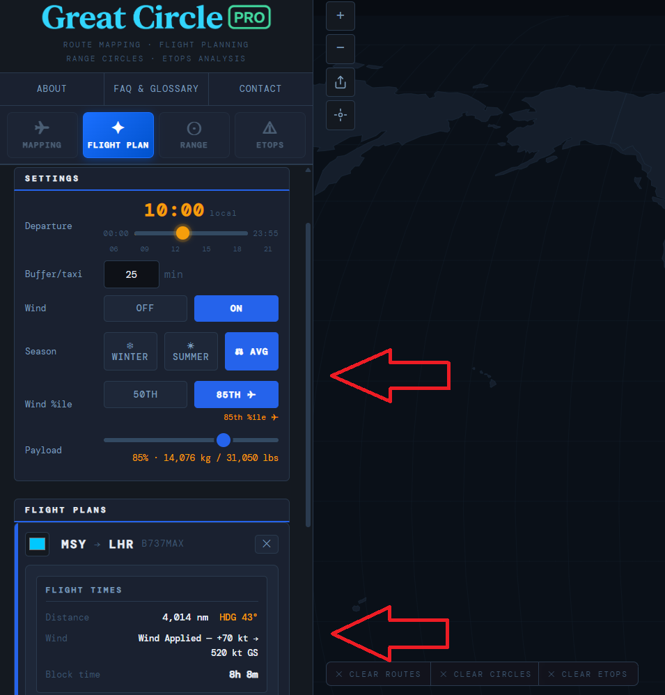
Great Circle Pro's Flight Planning tab gives airline planners, charter operators, and pilots a precise, wind-adjusted flight time calculator built directly into the route map. Unlike basic distance tools, it accounts for real-world upper-level wind patterns across every major corridor, so the block times you see reflect actual operating conditions, not still-air geometry.

The tool uses a global ERA5-derived wind grid segmented by season. Toggle between summer winds, winter winds, and a long-run average to understand how seasonal jet stream shifts affect block time on any routing. Eastbound versus westbound? The calculator handles asymmetric block times correctly, which is critical when scheduling crew duty periods and computing turn times. Block time also carries a climb-and-descent allowance tuned to each aircraft type, so a heavy widebody that takes longer to reach cruise is not treated like a quick-climbing regional jet.

The departure time slider sets your block departure in five-minute increments and immediately updates the estimated UTC arrival. All inputs are encoded into the page URL, so sharing a specific scenario is as simple as copying the link. Whether you are validating a published schedule, comparing aircraft types on a common sector, or roughing out a new route, the Flight Planning tab gives you a fast, map-integrated starting point grounded in real wind data.

  • Summer, winter, and average ERA5-derived 250 hPa wind grids
  • Departure time slider with five-minute resolution
  • Correct eastbound and westbound asymmetric block times
  • UTC arrival with full URL state encoding for easy sharing
Plan a route now →
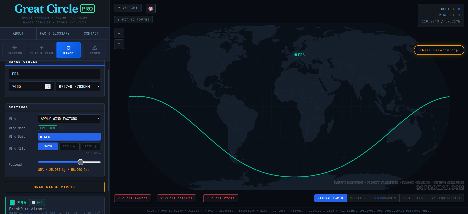
Frankfurt Airport range circle showing wind-adjusted reach of a Boeing 787-9 at different wind percentiles
Primary Tool Range Circles

Wind-Adjusted Aircraft Range Circles

Understanding what is reachable from any airport is one of the most fundamental questions in route planning, fleet deployment, and network strategy. Great Circle Pro's Range Circle tool renders geodetically accurate range rings around any airport in the database, giving you an immediate picture of which destinations fall within a given aircraft's maximum range.

Unlike flat-map range circles that distort severely with latitude, Great Circle Pro draws rings that correctly represent true great circle distance from the center point. This matters most at high-latitude hubs where Mercator distortion would make nearby destinations appear farther and distant polar-track cities appear closer than they are. The rings here reflect actual flight distances, not cartographic illusions.

Set the range in nautical miles or kilometers and place multiple concentric rings simultaneously to compare range variants of the same aircraft family or model different payload scenarios against range limits. Move the center point to any airport in the database and the rings replot instantly. Network planners use this to evaluate hub viability, spot thin markets just within reach, and compare fleet options without leaving the browser.

  • Geodetically accurate rings - no Mercator latitude distortion
  • Multiple concentric rings for variant and payload comparison
  • Input in nautical miles or kilometers
  • Instant replot when the center airport changes
Plot your range →
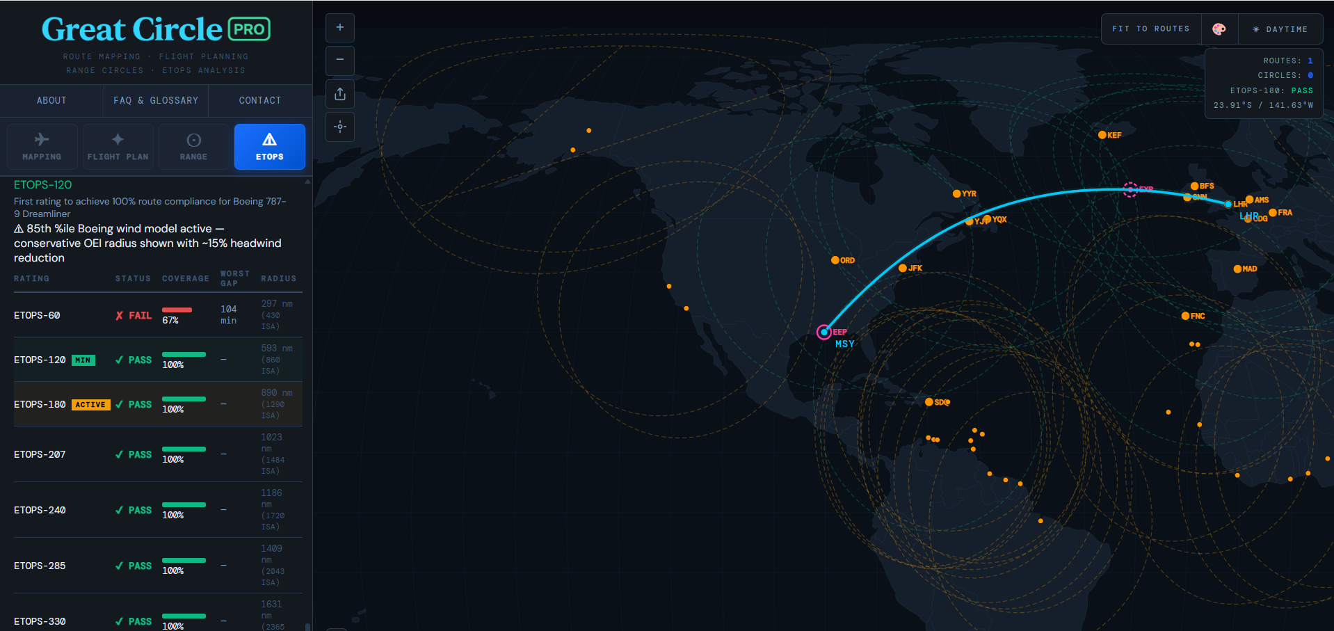
Great Circle Pro ETOPS diversion coverage rings overlaid on a transoceanic great circle route
Primary Tool ETOPS Analysis

ETOPS / EDTO Diversion Coverage Map

Extended Operations, ETOPS under FAA rules or the ICAO equivalent EDTO, require twin-engine aircraft to remain within a defined diversion threshold of an adequate alternate airport for the entire route. Great Circle Pro's ETOPS tab turns this regulatory requirement into a visual, interactive planning tool that shows exactly where a route is exposed and which airports provide coverage along the way.

Enter your aircraft's approved ETOPS threshold, 60, 120, 180, 207, 240, 285, 330, or 370 minutes, and Great Circle Pro draws the corresponding OEI diversion rings around your selected en-route alternates overlaid directly on the great circle track. Buttons exceeding the selected aircraft's certification ceiling are greyed out so you can't accidentally analyse an unsupported rating. Any segment outside all active rings is immediately visible, surfacing coverage gaps before they appear in formal route approval or dispatch review.

This is especially valuable on oceanic and polar routes where alternate density is low. The North Atlantic, South Pacific, and Arctic corridors each present unique ETOPS planning challenges. Sweep every ETOPS rating from 60 to 370 minutes in the sensitivity table to see exactly which rating a route needs and how much margin each step buys. The tool is a visual planning and educational aid, not a substitute for official ETOPS dispatch documentation, but a fast sanity check that takes seconds rather than hours of manual chart work.

  • Configurable ETOPS thresholds from 60 through 370 minutes, gated per-aircraft certification
  • Diversion rings overlaid directly on the great circle track
  • Multi-alternate coverage modeling with dynamic add and remove
  • Supports oceanic, polar, and overwater route analysis
Analyze your route →
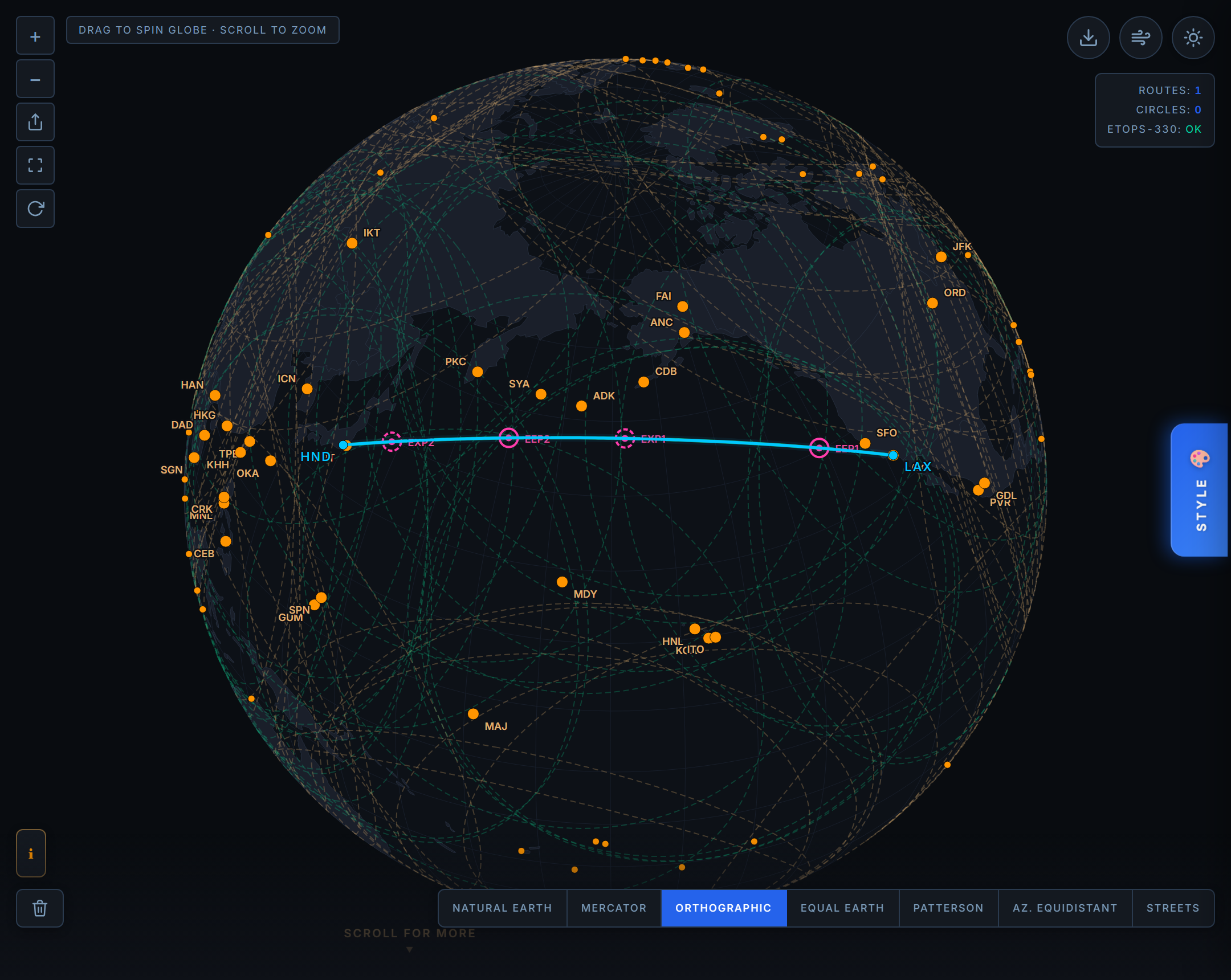
Great Circle Pro ETOPS map with diversion alternates colored by coverage: in range and landable, in range but runway too short, and out of range, along a North Pacific great circle route
ETOPS Alternates

Diversion Alternates You Can Actually Land On

Being inside the one engine inoperative diversion radius answers only half of the question. It tells you the aircraft can reach a field, not that it can land there. A diversion airport is genuine coverage only if it also has a suitable paved runway long enough for the specific aircraft you are flying. Great Circle Pro now runs that second check on every alternate, so a field that is in range but could never take your aircraft is no longer counted as coverage.

The map now separates in range from in range and landable, and every alternate shows its longest runway against the length your aircraft needs. A field that is close enough to reach but cannot land your aircraft, exactly the kind a check that looked only at range would have painted as good, is caught before it reaches a dispatch decision. That is ETOPS coverage you can trust at a glance, with no "in range but unlandable" surprises.

  • Two independent tests on every alternate: inside one engine inoperative diversion range, and served by a runway your aircraft can actually use
  • Requires a suitable paved runway long enough for the specific aircraft type selected
  • Coverage states separate a reachable field from a reachable and landable one, so a too short runway is never mistaken for coverage
  • Runway readout on every alternate, its longest runway against the length your aircraft needs, right on the map
Check your alternates →
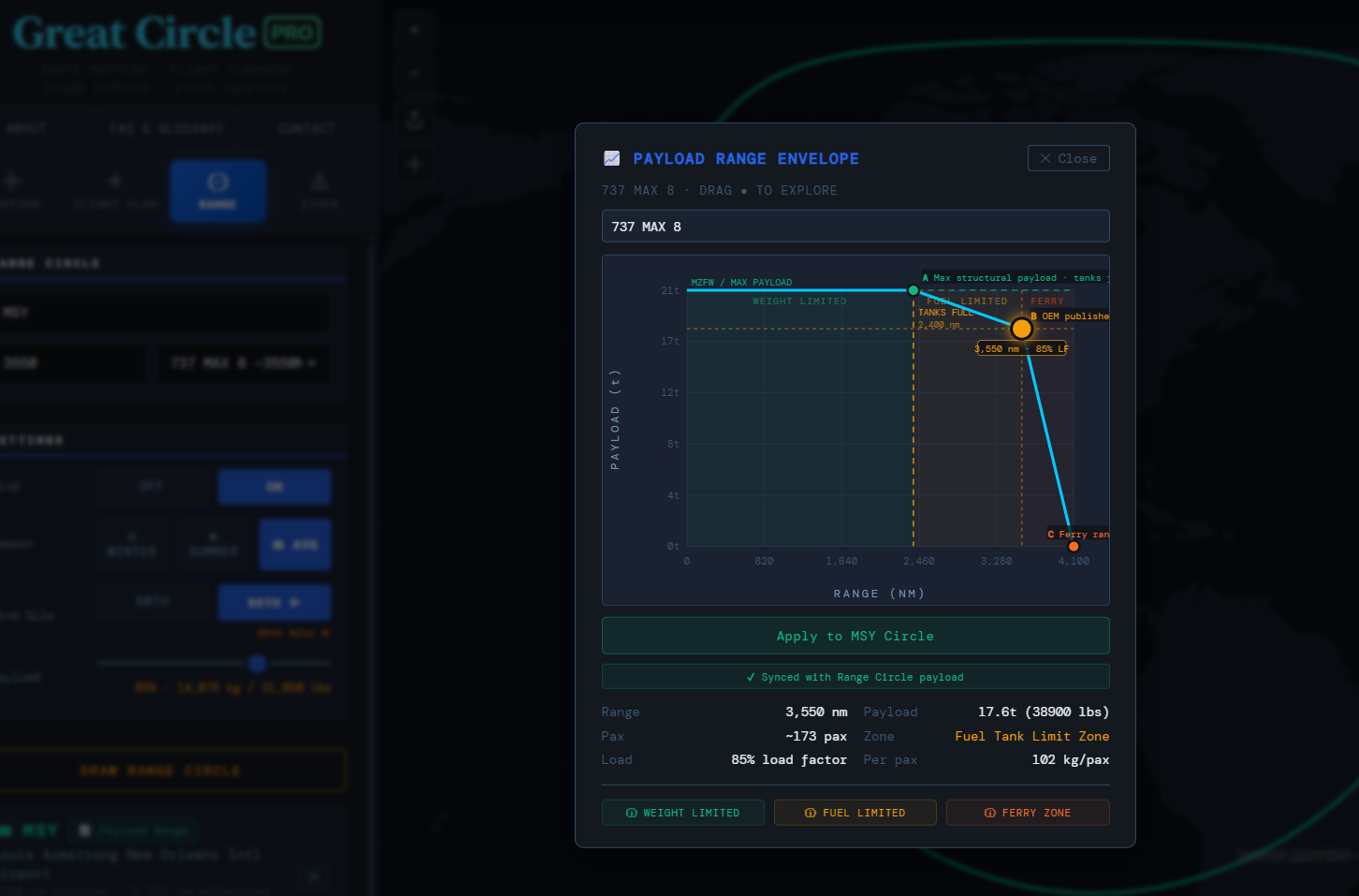
Interactive payload-range envelope chart for the 737 MAX 8 showing weight-limited, fuel-limited, and ferry zones
Payload-Range Chart

Interactive Payload-Range Performance Chart

Payload-range charts define the performance envelope of an aircraft: the trade-off between how much revenue payload can be carried and how far it can be flown. Great Circle Pro's Payload-Range tab renders this chart interactively in the browser, letting planners and analysts plot the performance boundary of any aircraft type and overlay specific route distances against it.

The chart renders the three-segment payload-range curve that characterizes jet transport aircraft: the maximum structural payload segment where range is fuel-limited, the intermediate segment where payload trades for additional range, and the maximum fuel range segment where both payload and reserves sit at minimum. Each point on the curve reveals a dimension of operational flexibility, from belly freight capacity and full-load feasibility on long sectors to the outer limit of economic range extension.

Plot multiple aircraft types simultaneously to compare capabilities side by side and drop route distances directly onto the chart to see whether a mission falls in the unrestricted payload zone or into the trade-off region. Route strategists find this particularly useful when evaluating thin long-haul markets, assessing whether a longer-range variant is warranted, or quickly confirming whether a routing is physically feasible before deeper performance analysis.

  • Three-segment curve with correct structural and fuel-limited breakpoints
  • Multi-aircraft overlay for side-by-side type comparison
  • Route distance plotted directly on the chart
  • No software installation - runs entirely in the browser
Build a P-R chart →
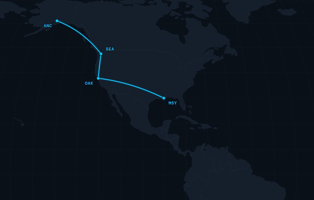
Great Circle Pro multi-leg chain routing showing an ANC-SEA-OAK-MSY flight sequence on a dark world map
Chain Routing

Multi-Leg Route Chain Builder

Real-world operations are rarely point-to-point. Aircraft rotate through multi-sector sequences, and understanding the cumulative time and distance of a full rotation is essential for scheduling, crew planning, and operational feasibility analysis. Great Circle Pro's Chain Routing tab lets you build multi-leg sequences that carry departure and arrival times forward through every successive sector, with a configurable ground buffer between each leg.

Add as many legs as your itinerary requires. Each leg inherits its departure time from the prior leg's arrival plus the buffer you set. Wind-adjusted flight times propagate correctly through the full chain, so the UTC time shown at each waypoint reflects realistic block times rather than still-air estimates. The result is a complete itinerary with departure and arrival UTC at every stop.

Chain routing is especially useful for ferry flights, proving runs, and technical positioning sequences where multiple stops connect a final delivery. It works equally well for modeling code-share itineraries, evaluating a rotation against crew duty period limits, or presenting a multi-stop charter journey to clients who want to see the whole trip at once. Every leg renders as an individual arc on the main map, keeping the visual and the numbers in sync throughout the build.

  • Unlimited legs with automatic UTC time propagation across the full chain
  • Configurable ground buffer between each sector
  • Wind-corrected block times carried through every leg
  • All legs rendered simultaneously as arcs on the live map
Build a chain route →
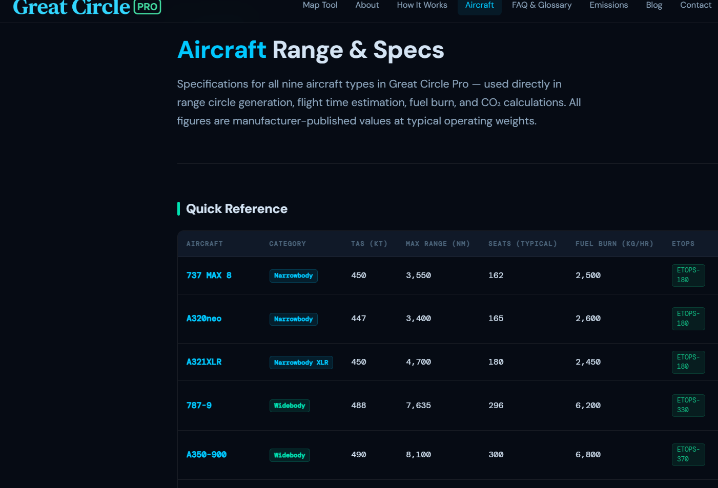
Great Circle Pro aircraft performance database showing range and speed data for commercial airliners
Aircraft Database

Aircraft Range & Performance Reference

Great Circle Pro includes a searchable aircraft performance database covering the airliners, regional jets, turboprops, and general aviation types most commonly used in route planning analysis. Each aircraft entry includes published range figures, typical cruise speed, fuel burn estimates, payload capacity, and links to manufacturer performance documentation where available.

The database spans the full spectrum of commercial and general aviation: narrowbody workhorses (737 MAX 8, A320neo, A220-300, A321XLR), long-haul widebodies (787-9, A330-900neo, A350-900, A350-1000, 777-9, 777-300ER), ultra-long-range variants (A350-900ULR) capable of 19-hour nonstops, corporate VIP airframes (ACJ350-900, ACJ350-1000), freighters (A350F, 747-8F), regional jets (CRJ-900), business jets (Cessna Citation X+, CJ3+ and CJ1+, plus the HondaJet, Gulfstream, and Bombardier Global families), and general aviation (King Air B200, Cessna 172). Each entry is integrated directly with the Flight Planning and Range Circle tools so selecting an aircraft type instantly populates the correct OEM-verified performance figures across every calculation on the map.

The aircraft page also includes payload-range envelope data for each type, letting you visualize the performance trade-off curve before opening the full interactive P-R chart. Fuel burn figures are presented in both kilograms and pounds per hour at typical cruise conditions, alongside CO2 emission factors for environmental impact assessment. Whether you are evaluating which aircraft fits a thin long-haul market, studying the difference between 737 MAX variants, or comparing narrowbody options for a new route, the aircraft database gives you the performance grounding to start that analysis with confidence.

  • Full commercial fleet from narrowbodies to ultra-long-range widebodies
  • Integrated with Flight Planning and Range Circle tools
  • Payload-range envelope data and fuel burn figures per type
  • CO2 emission factors for each aircraft category
Browse the aircraft database →
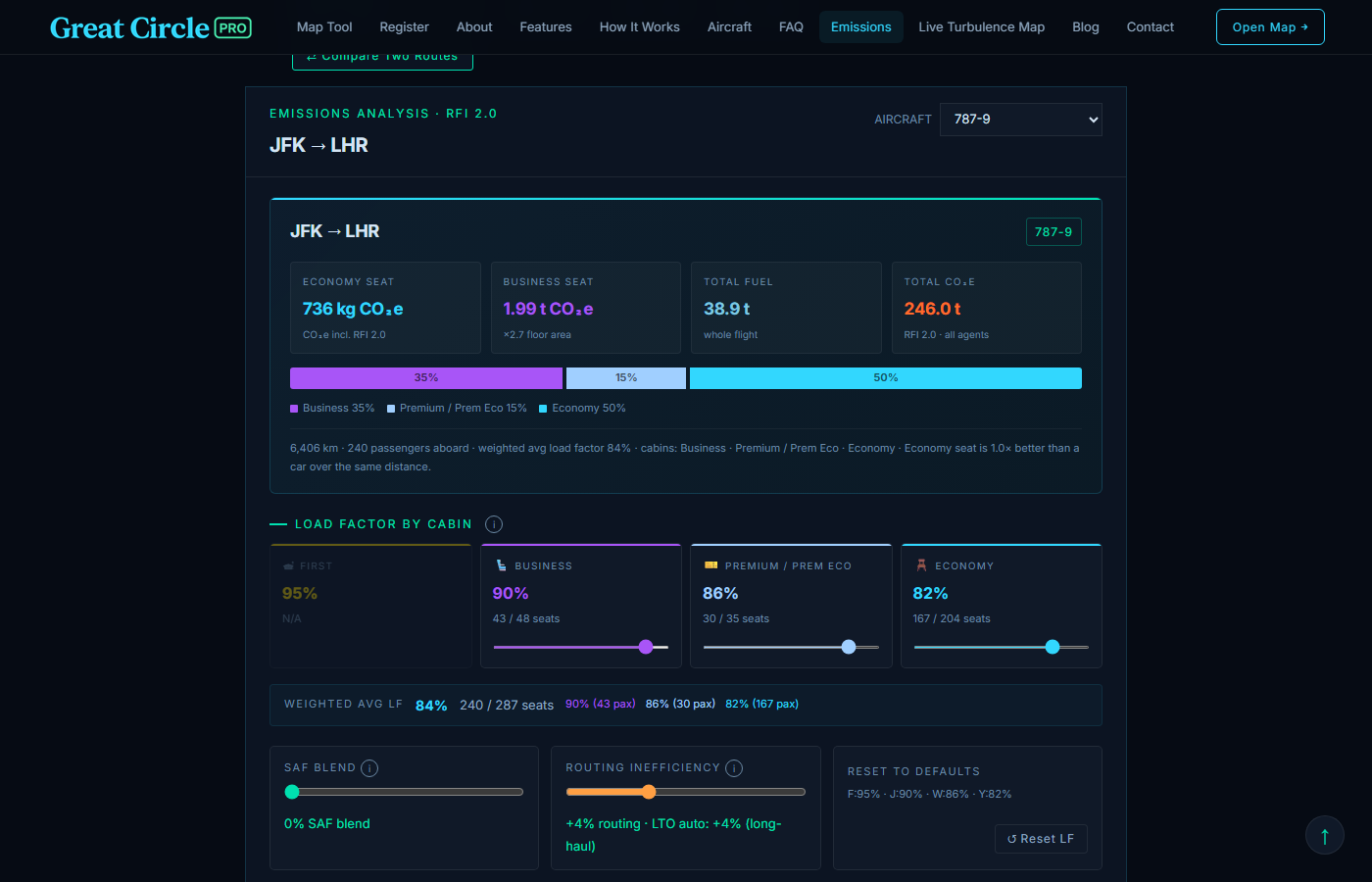
Great Circle Pro Tier 2 emissions modal showing per-class CO2, RFI, and SAF blend
Emissions

Flight Emissions & CO2e Modal

Every Flight Plan card includes a Tier 2 Emissions Breakdown button that opens an interactive modal with the full carbon accounting picture for the selected route. Fuel burn is modelled per aircraft type across the climb, cruise, and descent phases of the flight, scaled by load factor; CO2 uses the standard 3.16 kg per kg of Jet-A stoichiometric ratio; CO2e applies Radiative Forcing Index 2.0 from Lee et al. 2021 to account for non-CO2 cruise-altitude warming effects (contrails, NOx, water vapour).

The modal breaks per-pax emissions down by cabin class: first, premium, business, and economy. It uses floor-area normalization. A first-class passenger correctly carries roughly 4× the per-pax footprint of an economy passenger on the same flight. A SAF blend slider models the lifecycle reduction from sustainable aviation fuel at any blend from 0% to 100%. A comparison chart ranks the route across the full 18-aircraft fleet. You can see which type delivers the lowest grams of CO2 per passenger-km for that mission.

Freighters render with zero per-pax figures and surface total-cargo CO2 instead. The whole calculation runs client-side, no API calls, and the modal updates live as you drag the load-factor or SAF sliders.

  • Per-class CO2 breakdown with floor-area normalization
  • RFI 2.0 (Lee et al. 2021) for honest non-CO2 cruise-altitude warming
  • SAF blend slider with lifecycle-emissions accounting 0-100%
  • Cross-fleet comparison chart ranks the full aircraft library for the same route
Open the emissions methodology →
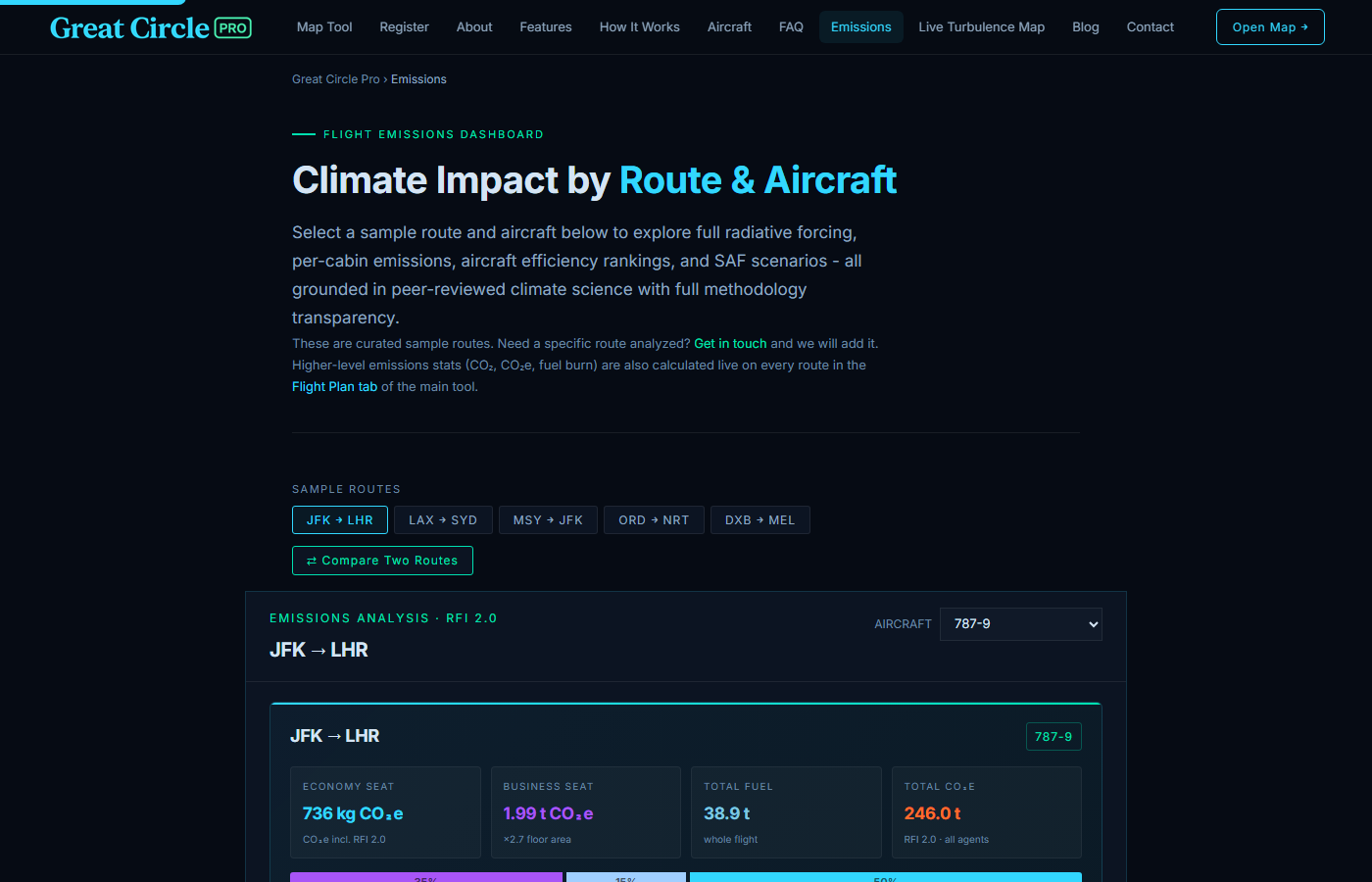
Great Circle Pro standalone flight emissions calculator dashboard showing per-cabin CO2e, total fuel, and RFI-weighted CO2e by route and aircraft
Emissions Calculator

Standalone Flight Emissions Calculator

The dedicated Emissions page is the deep-dive companion to the in-app Tier 2 modal. It is a full-page calculator. It walks any flight through the same physical chain: fuel burn, combustion CO2, RFI-weighted CO2e, contrail risk, SAF reduction, mode comparison. Every methodology choice is made explicit. It is built for the reader who wants to understand why a 787 transatlantic burns roughly half what an A350 burns transpacific, not just see a single headline number.

Fuel uses a cruise kg/nm coefficient plus a fixed ICAO Engine Emissions Databank LTO kg per cycle. It is the same model the Tier 2 modal uses. The dashboard lays it out alongside the cabin allocation, the radiative-forcing breakdown, and the curated sample routes (JFK-LHR, LAX-SYD, ORD-NRT, DXB-MEL). A side-by-side comparison takes a single click. The compare two routes toggle puts any pair head to head. The result shows the per-economy-seat delta in kilograms of CO2e.

The dashboard surfaces what a quick widget can't. There is a glossary on RFI 2.0 versus the Lee 2021 ERF. The ceiling on SAF is roughly 36.5% on RFI-weighted CO2e at a 100% blend, because non-CO2 forcings don't go away. Contrail risk depends on engine generation and time of day. The IATA floor-area method allocates a long-haul business seat at roughly 2.7× the per-economy footprint. Every number is computed client-side with no API calls.

  • Per-aircraft cruise kg/nm + fixed ICAO EEDB LTO kg/cycle
  • Four contrail-risk drivers: latitude, season, local time of day, engine generation
  • Curated sample routes plus side-by-side compare-two-routes mode
  • Full glossary covering RFI, SAF, LTO, contrail forcing, gCO2/RPK
  • CORSIA offset-cost range and the realistic SAF ceiling, not the headline 73%
Open the emissions calculator →
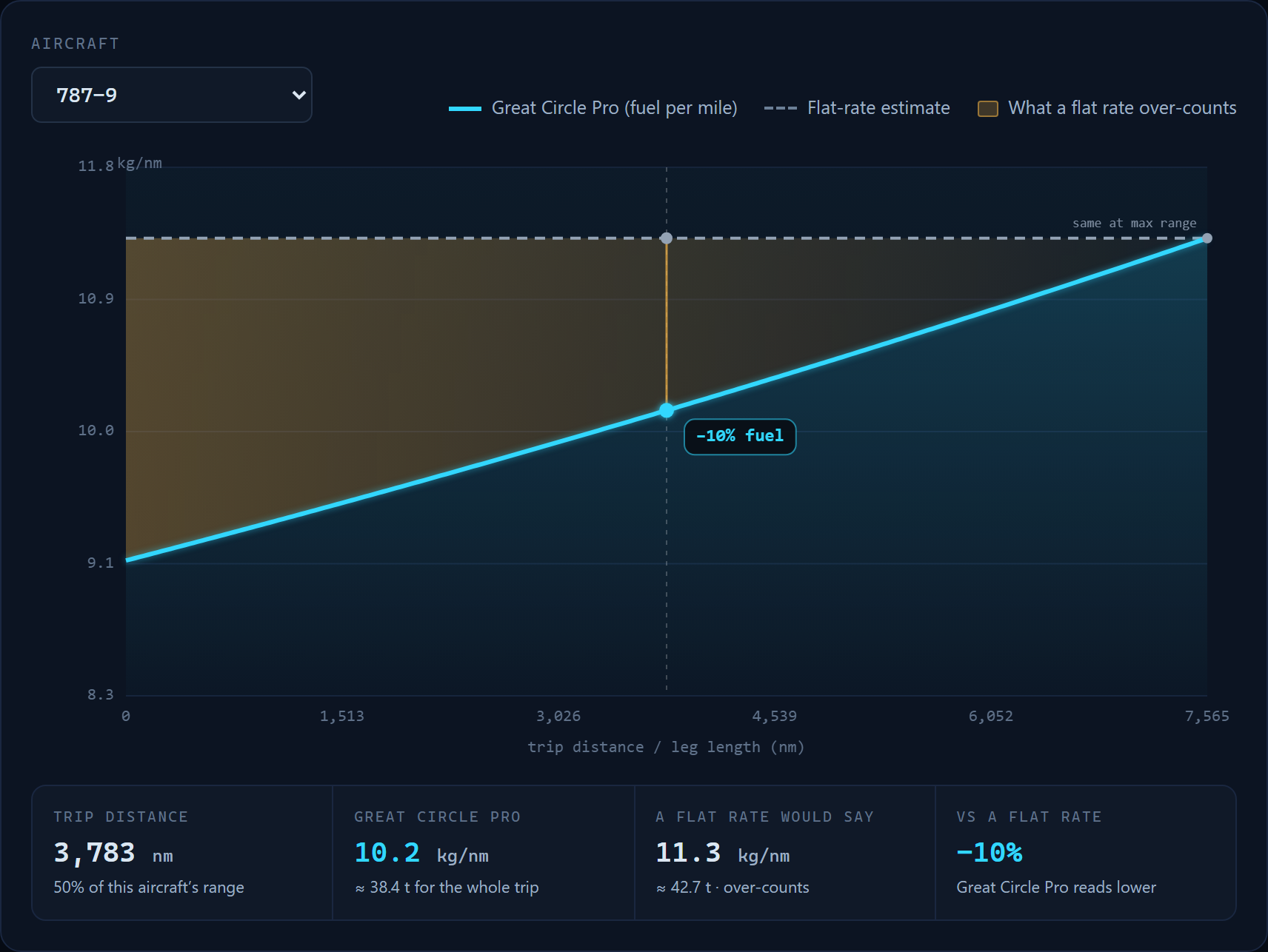
Great Circle Pro Breguet Effect chart comparing a constant-rate fuel assumption against the real weight-shedding cumulative burn curve for a 787-9
Fuel Model

Weight-Shedding Breguet Fuel & CO2 Model

An airliner is heaviest at takeoff and sheds weight every mile as it burns fuel, so it burns more per mile early in a flight and less late. Most quick range tools ignore this and apply one flat rate. Great Circle Pro uses the classic Breguet range equation instead, the same weight-shedding physics a flight-planning department relies on, and the most accurate way to tie fuel to weight and distance.

Because it reproduces every manufacturer's published maximum range exactly, range circles, ETOPS coverage, and reserves all match the spec sheets, while a shorter, lighter sector correctly shows a few percent less fuel and CO2 than a flat rate would. The airplane always burns its real amount; it is a flat rate that over-counts anything short of a full-range flight, most on the ultra-long-haul twins. The endpoints match the brochures; the curve in between bends the way the real airplane flies.

And because carbon follows fuel directly, getting the fuel right gets the CO2 right too. It runs live on every Flight Plan card and in the emissions dashboard, entirely client-side with no API calls.

  • Cruise burn follows the real Breguet weight-shedding curve, not a flat rate
  • Matches each type's published maximum range, so the range rings match the spec sheets
  • Per-type Breguet constant from published operating weights
  • Interactive explainer chart with a draggable fuel readout
See the Breguet Effect →
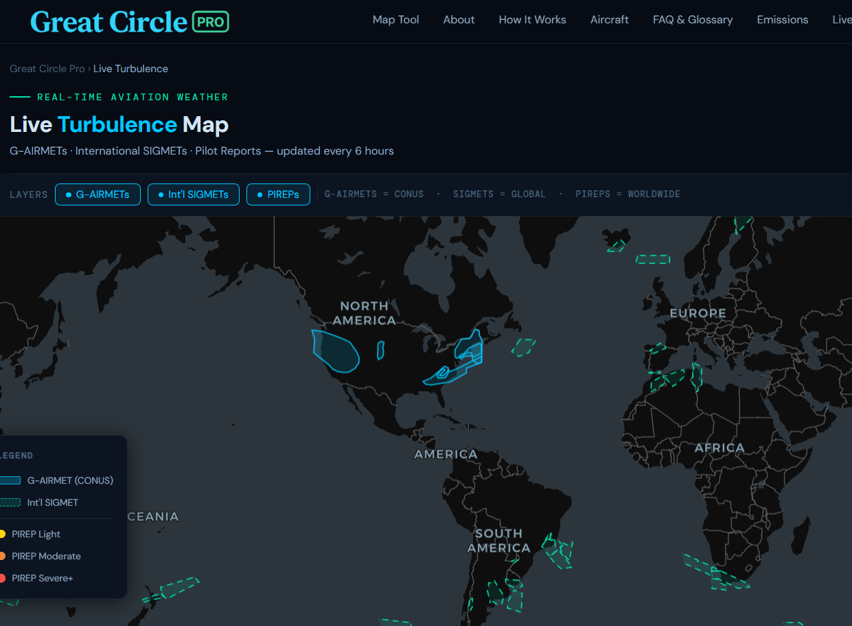
Great Circle Pro live turbulence map showing real-time SIGMET and PIREPs across global flight corridors
Live Turbulence

Live Aviation Turbulence Map

Great Circle Pro's Live Turbulence Map overlays current turbulence advisories across the global route network, sourced from G-AIRMETs, international SIGMET reports, and pilot reports (PIREPs). The data refreshes on an hourly schedule from official advisory feeds, and the page shows exactly how fresh the current snapshot is.

The tool is particularly useful for understanding why certain route corridors see significant deviations from the filed flight plan, where jet stream turbulence is creating passenger comfort and fuel burn impacts on transatlantic and transpacific routes. Turbulence data is displayed as color-coded intensity overlays ranging from light to extreme, with SIGMET boundaries drawn directly on the map.

For pilots, dispatchers, and aviation weather enthusiasts, the Live Turbulence Map provides a quick, visual synthesis of the current upper-air weather picture without requiring access to specialized meteorological software. Overlay it mentally against the great circle routes you have plotted in the main tool to understand how today's weather is shaping actual routing and block time on any corridor. It is the same kind of big-picture situational awareness that experienced dispatchers develop over years, now accessible in a browser tab alongside the rest of the Great Circle Pro planning tools.

  • G-AIRMET, SIGMET, and PIREP advisories, refreshed hourly
  • Color-coded intensity from light to extreme
  • Global coverage across all major flight corridors
  • Continuously updated, not a static forecast snapshot
Open the turbulence map →
Restricted-airspace overlays on a great-circle map showing route detours around closed regions
Airspace Avoidance

Closed Airspace Avoidance Routing

Since 2022, a meaningful share of long-haul routing has been shaped less by geography and more by which regions of airspace are actually overflyable. Russia, Belarus, Ukraine FIR, Syria, Libya, Yemen, Sudan, North Korea, and Afghanistan are closed or restricted to most Western carriers, with partial sector restrictions over Iran. A great circle that ignores those closures looks geographically pretty but tells you nothing about how an aircraft will actually fly the route.

Great Circle Pro's Airspace toggle on the Flight Plan tool fixes this. Turn it On and any route whose great circle would cross a restricted region detours around the boundary, recalculating block time, fuel burn, range check, and CO2 against the longer flown arc, not the haversine. The detour is highlighted with an amber chip listing the regions avoided and the added distance, so you always see exactly what changed.

The polygons are curated quarterly against the EASA Conflict Zone Information Bulletins and the FAA Special Federal Aviation Regulations. Every entry traces back to an authoritative public source, so the avoidance pattern reflects current regulatory reality, not folklore. Some zones even carry an altitude floor, so a corridor closed to a turboprop can stay open to a jet overhead. The toggle defaults Off so users who want the geographic ideal keep it; turn it On when you want to model the operational reality.

  • Off/On toggle on the Flight Plan tool
  • Real filed airline routing where one is known for the pair, an efficient estimate otherwise
  • Side-by-side comparison of the detour against the plain great circle
  • Block time, fuel, range check, and CO2 all recalculated against detoured nm
  • Polygons sourced from EASA CZIBs and FAA SFARs, reviewed quarterly
Try airspace avoidance →
Great Circle Pro blog covering aviation route planning methodology and flight analysis
Blog

Aviation Route Planning Guides & Analysis

The Great Circle Pro blog covers the methodology, math, and real-world application behind every tool on the platform. Articles range from introductory explainers on why great circle routes look curved on flat maps to deep dives into ETOPS regulatory history, polar routing economics, and the aerodynamics that determine payload-range trade-offs on long-haul widebodies.

Recent posts have examined why Great Circle Pro uses the 85th percentile as a conservative ETOPS sensitivity view, why the Boeing 787 and Airbus A350 opened previously uneconomical city pairs, and how range circle analysis can reveal which airports are genuinely competitive as connecting hubs versus which ones only appear that way due to Mercator projection distortion. Each post is written for readers who already understand the basics of commercial aviation and want to go deeper.

The blog also tracks new features as they are added to Great Circle Pro, with worked examples showing exactly how to use new capabilities in real planning scenarios. If you have used the tool to analyze a specific route or identify an interesting great circle anomaly, the blog is the best place to find the context that makes those observations meaningful. Posts are published regularly as new analytical techniques and route planning methodologies are added to the platform.

  • In-depth methodology articles on great circle routing and wind modeling
  • ETOPS regulatory analysis and polar routing economics
  • Worked examples using real routes and real aircraft performance data
  • Feature announcements with step-by-step usage guides
Read the blog →
Start planning - it's free

Great Circle Pro requires no payment and no software installation. The core tool works without an account; a free email sign-in unlocks the full aircraft fleet and the wind modeling toggles.

Open Map Tool →