How Great Circle Pro Works
The planning assumptions behind every feature, from great circle routing to range envelopes shaped by wind, seasonal wind models, ETOPS and EDTO diversion analysis, fuel burn, emissions, and payload range tradeoffs.
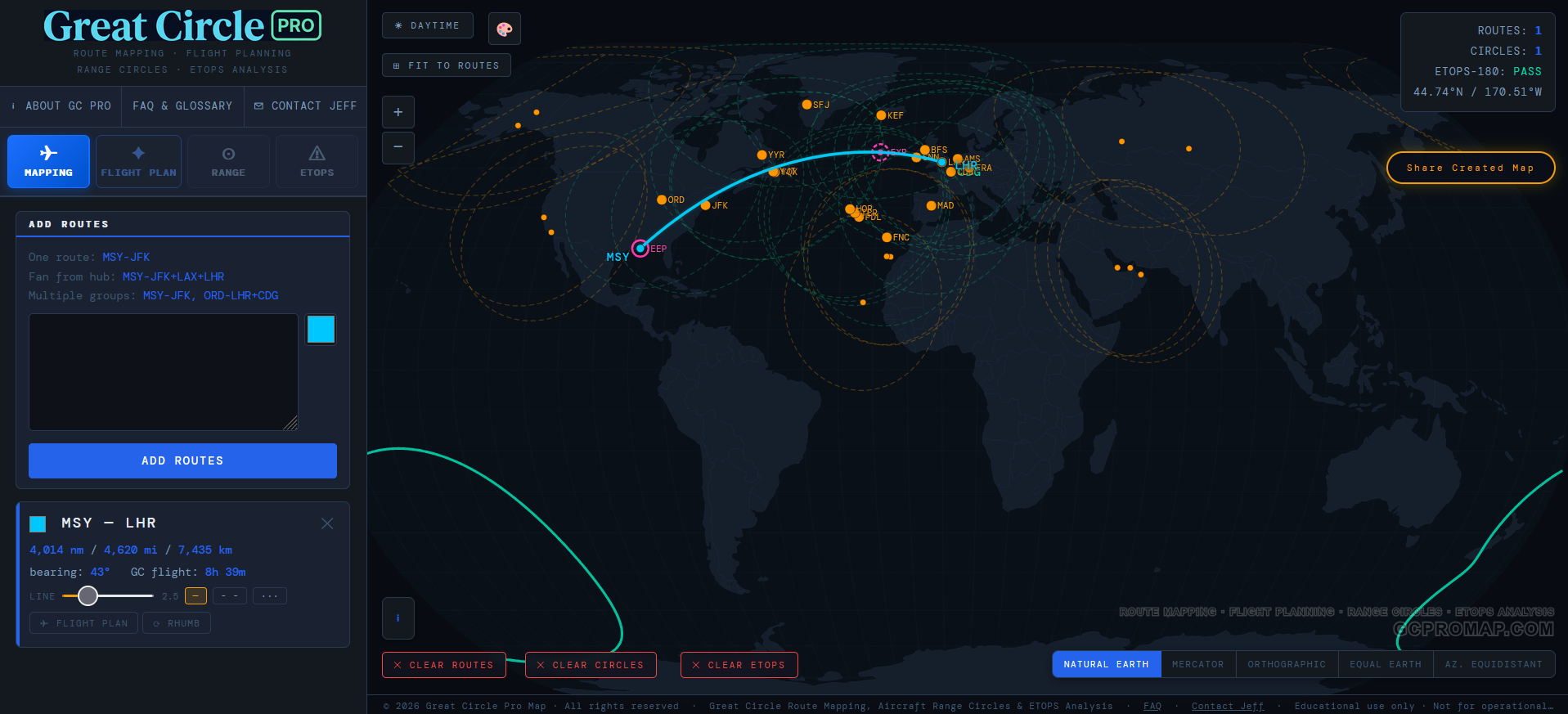
Great Circle Routing
Great Circle Pro draws the shortest practical path between two airports on the curved surface of the Earth. That is why a route that looks bowed on a flat map may be the most direct path on a globe.
The map keeps each projection honest, so a route that curves across a flat world map appears correctly on the globe view. The route card also shows the extra distance of a constant heading rhumb line as a planning reference. On short hops the difference is negligible. On long oceanic routes it can become a surprisingly expensive detour.
Wind Adjusted Range Circles
A range circle is the set of all points an aircraft can just barely reach from a given airport. Without wind it's a perfect geodesic ring. With wind, it becomes something more interesting: an asymmetric envelope whose shape is driven by the jet stream, the trades, and every wind regime in between.
Great Circle Pro builds each range envelope around the origin airport and adjusts the reach by direction. Favorable winds can stretch the circle outward when the Tailwind credit toggle credits them (the conservative default does not). Headwinds compress it inward. The result is a smooth, closed contour that reflects how the atmosphere affects usable range without treating the aircraft as a simple still air circle.
The contour is kept smooth and physically reasonable, so even a strong jet stream day cannot produce a noisy or distorted shape. The circle might get stretched into a dramatic egg, but it stays readable and useful for planning.
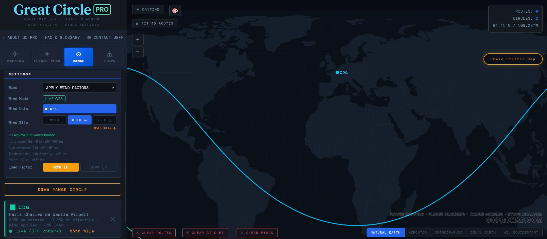
The result is an asymmetric envelope. The lobe pointing downwind stretches outward while the upwind face compresses inward. On a typical North Atlantic departure, the difference between the eastern and western reach of the ring can easily exceed several hundred nautical miles. That is a lot of cities that suddenly fall on one side or the other of "can we get there nonstop."
Why upper air winds? Aircraft range is shaped most by the winds near cruise altitude, where the jet stream lives. Surface wind is not enough for this kind of planning view.
Tailwind credit: conservative vs. directional
Range diagrams can answer two different planning questions. The conservative view asks, "what reach should I trust without giving the airplane a favorable wind bonus?" The directional view asks, "how does the usual wind field reshape this mission in each direction?" Neither view is a formal OEM doctrine. They are two practical ways to visualize the same payload and range envelope.
Great Circle Pro exposes this as the Tailwind credit toggle. Off is the default conservative view: headwinds still dent the upwind side, but favorable winds do not extend the downwind side past the still air reach. On allows favorable winds to extend the downwind lobe, so the envelope can form a more directional egg. The toggle changes only how the wind benefit is credited to the envelope shape. The aircraft, payload, reserves, hot day allowance, and airways allowance are identical either way.
Hot days and airways: the other two allowances
Wind is not the only thing that trims real world range. Two further allowances are folded in, both matching how the manufacturers plan. First, a hot day temperature allowance: a warm day means thinner air, more fuel burned in the climb, and a lower efficient cruise altitude, all of which shorten range. Manufacturers plan to a hot reference temperature that is only exceeded a small fraction of the year, and the effect is larger in the tropics than near the poles. Second, an airways and traffic allowance: filed routes are never the exact great circle, so the distance you can actually reach is a little shorter than the geometric radius. The allowance is scaled to stage length: departure and arrival procedures are a fixed overhead, so a short regional sector carries a proportionally larger allowance than a long-haul mission, mirroring how regional and long-haul manufacturers each plan. Both allowances apply with either Tailwind credit setting, giving a coherent picture across wind, temperature and routing at once. Each appears as its own line in the ring card's "where did my range go?" breakdown.
Wind Data and Seasonal Models
Great Circle Pro's wind model follows the seasons. Separate Winter and Summer climatology models capture the typical upper air pattern in each season, with an Average mode that blends them. The model covers the full globe and reflects the major features of circulation: the mid latitude jet stream that bends a range circle into an egg, the subtropical jet, the equatorial trade winds that blow the opposite direction, and polar winds at high latitudes.
Each wind regime has its own personality. A range circle from Singapore in trade wind territory looks very different from one drawn out of Anchorage in the North Pacific jet. The transition between wind regimes is handled smoothly, so routes do not jump abruptly as they cross from one region into another.
The wind mode selector: Winter, Summer, and Average
Anyone who has flown westbound across the Atlantic in January already understands seasonal wind variation on a personal level. The jet stream is not a fixed feature. It migrates with the seasons, strengthening in winter when the temperature gradient between the tropics and the poles is steepest, and weakening in summer when that gradient relaxes.
Great Circle Pro gives you three wind modes, all based on long term seasonal climatology:
| Mode | Source | What You're Seeing |
|---|---|---|
| ❄ Winter | Northern Hemisphere winter pattern | Peak jet stream strength. The jet core shifts equatorward and intensifies. This is your toughest westbound headwind season. |
| ☀ Summer | Northern Hemisphere summer pattern | The jet weakens and shifts poleward. Range circles become noticeably more symmetric, and westbound flights get a bit more breathing room. |
| ⚖ Avg | Year round blend of Winter and Summer | A year round blend of the winter and summer models. Useful for planning when you need a single representative envelope rather than a seasonal extreme. |
Why does this matter? Because an airline evaluating a year round route needs to know whether the airplane can make it in January, not just in July. Drawing the winter and summer circles side by side from the same airport immediately reveals the seasonal swing. If the destination falls inside the summer circle but outside the winter one, you have a seasonal route on your hands, or you need a bigger airplane.
When you first toggle Wind to "On" in the Range tab, the tool defaults to Avg mode. That is the safest starting point for general planning. Switch to Winter when you need to test a route against the toughest season.
The wind data is global. Both hemispheres are covered. A range circle from Johannesburg or Sydney uses the same planning framework as one from London or Chicago, while still reflecting the different character of Southern Hemisphere winds.
Percentile Models
Seasonal averages tell you what a typical winter or summer day looks like. But within any given season, wind speeds bounce around from day to day. Some January days the jet stream is unusually strong; other January days it is much more relaxed. A range circle needs to account for this variability, and that is where the percentile model comes in.
Great Circle Pro offers two percentile settings that represent different levels of atmospheric intensity:
| Model | What It Represents | Primary Use |
|---|---|---|
| 50th Percentile | Median wind speed. Conditions you would expect on a typical day. | Everyday planning, block time estimates, general network analysis |
| 85th Percentile | Wind speed exceeded only 15% of the time. A strong but realistic jet stream day. | Conservative range analysis, ETOPS diversion planning, adverse-wind sensitivity studies |
The percentile setting is not treated as one universal adjustment. Wind variability is different in the tropics, the mid latitude jet, and polar regions, so the conservative view behaves differently depending on where the route flies.
Why two defaults: 50th for view, 85th for ETOPS
The Flight Plan and Range Circle tabs default to the 50th percentile, the climatological mean. This is the normal operations view: seasonal-average winds, the conditions you would expect on a typical flight, and the right baseline for block time estimates and everyday route comparisons. You can flip to 85th in one click when you want a more conservative adverse wind view.
The ETOPS Sensitivity Analysis panel keeps the 85th percentile regardless of what the Flight Plan / Range Circle tabs are set to. ETOPS is the conservative diversion coverage check, so the tool keeps the adverse wind view on that panel by design, even when you have moved the FP/Range view to 50th for normal operations planning.
The logic of 85th is simple: if you size a diversion radius to median winds, that radius can be too generous on adverse wind days. For a remote route diversion view, Great Circle Pro uses the 85th percentile so the modeled radius is tested against stronger than average headwinds rather than a calm or median case.
Why ETOPS pins 85th regardless of the FP setting: when an engine fails over the ocean, the aircraft must divert to an alternate airport at reduced One Engine Inoperative (OEI) speed, potentially into strong headwinds. Pinning the ETOPS Sensitivity panel to 85th keeps the on screen diversion radius conservative and prevents a silent downgrade if the user has moved the global wind percentile to 50th for normal operations planning elsewhere in the tool.
ETOPS / EDTO Diversion Analysis
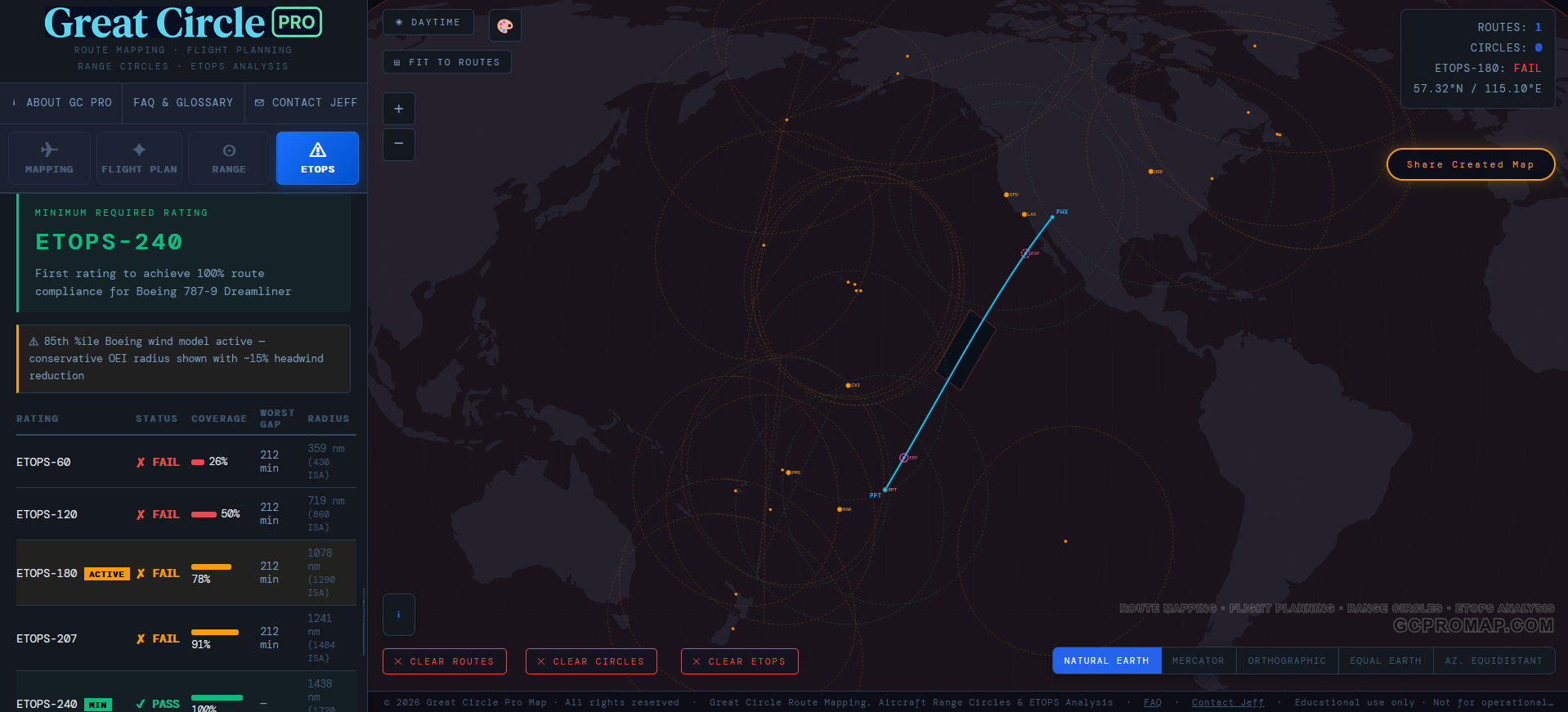
ETOPS (Extended Range Twin Engine Operational Performance Standards) defines how far a twin engine aircraft may operate from a suitable diversion airport. The analysis works like this:
- Check the route at regular intervals between origin and destination.
- Find adequate alternates from a curated diversion airport database along the route.
- Calculate OEI diversion time using the aircraft's published one engine inoperative cruise speed and the distance to each alternate.
- Draw OEI radius bubbles centred on each diversion airport at the selected ETOPS rating (60, 120, 180, 207, 240, 285, 330, or 370 minutes). Buttons exceeding the selected aircraft's certification ceiling are greyed out so you can't accidentally analyse an unsupported rating.
- Confirm each alternate is landable, not just reachable, by checking that it has a suitable paved runway long enough for the specific aircraft selected. A field that is in range but whose longest runway is too short, or that is unpaved, is flagged as reachable but not usable rather than counted as coverage.
- Classify each route segment as covered or exposed. Polar and island cluster routes that exit, reenter, and exit coverage again are reported as separate exposure segments instead of one overstated span.
- Mark EEP and EXP, the ETOPS Entry Point (first point beyond standard coverage) and ETOPS Exit Point (where coverage resumes).
Coverage is now two independent tests, not one. An alternate has to be both in range on one engine and landable: reachable within the rating, and served by a paved runway long enough for the aircraft you selected. A field that is in reach but cannot take your aircraft is called out as reachable but not usable, so an alternate that a range check alone would have counted as good is caught before it reaches a route verdict. For the full walkthrough, see In Range Is Not Enough: Can Your Aircraft Actually Land There?.
Reach is not landing. Being inside the diversion radius is a geometry question. Whether the aircraft can stop on the runway there is a performance question. An adequate alternate has to answer both, and the tool now checks each one.
The ETOPS sensitivity panel lets you sweep through all standard ratings simultaneously, showing how the covered and exposed picture changes as the rating increases. That is useful for understanding what certification level a given route actually requires, without a lot of back and forth with the rule books.

Flight Time and Fuel Estimation
Flight time is calculated from route distance, the aircraft's true airspeed (TAS), and representative winds along the route. Detoured and preferred routings use their flown path rather than a simple straight line assumption. Air time also carries a climb and descent allowance that varies by aircraft type, since a heavy widebody takes longer to reach cruise than a regional jet, and block time adds a configurable taxi buffer, defaulting to 25 minutes, on top.
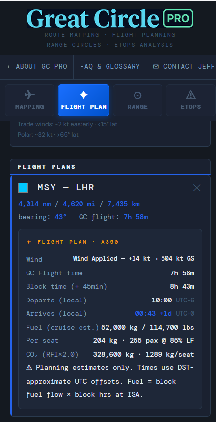
Fuel burn is built up per aircraft type across the climb, cruise, and descent phases of the flight, scaled by load factor (the methodology section below has more). CO2 follows the standard Jet A combustion relationship, and CO2e applies a default RFI 2.0 planning uplift for the additional warming from non CO2 effects of aviation at cruise altitude, including contrails, NOx, and water vapour. The dashboard also surfaces combustion only CO2 for users who need that view.
Emissions Calculations Methodology
The headline numbers on every Flight Plan card, and the full breakdown inside the standalone Emissions Calculator, come from a small set of physical inputs and a slightly larger set of methodology choices. The model is identical across both surfaces, so a route's CO2 in the Flight Plan tab matches its CO2 in the standalone dashboard.
Rather than averaging the whole trip at a single rate, fuel is built up by flight phase, per aircraft type: taxi, takeoff, climb, cruise, descent, and landing. Modelling the phases separately keeps both ends of the range honest. A short hop spends a much larger share of its block time climbing and descending, while a transoceanic flight is dominated by cruise. The flight time model also reflects broad aircraft class differences, so a heavier aircraft's slower climb shows up in both the block time and the burn.
Fuel carries fuel: weight change across the cruise
A real aircraft is heaviest at takeoff and sheds weight every mile as it burns fuel, so its cruise fuel flow falls steadily through the flight. It genuinely burns more per mile early on and less late, the classic fuel-carries-fuel effect described by the Breguet range equation, which is the standard way aircraft performance is calculated. Great Circle Pro uses it, and it reproduces each aircraft type's published maximum range exactly, so range circles, ETOPS coverage, and reserves match the spec sheets, while a shorter, lighter sector correctly shows a few percent less fuel and CO2 than a single flat rate would. The airplane always burns its real amount; it is a flat rate that over-counts the fuel on anything short of a full-range flight. There is a live, interactive explainer, with a chart you can drag, in our blog post Fuel Carries Fuel: The Breguet Effect.
Radiative Forcing Index
Burning Jet A at cruise altitude produces more than CO2. Nitrogen oxides, water vapour, soot, and contrails all affect aviation's climate footprint. Great Circle Pro uses RFI 2.0 as a transparent screening multiplier for the public calculator. It is not a certified greenhouse gas inventory method, and the science varies by time horizon and attribution method. That is why the dashboard surfaces combustion only CO2 alongside the RFI weighted number.
Sustainable Aviation Fuel
SAF is chemically near identical to Jet A in the engine. The savings live in the lifecycle: feedstock carbon uptake and lower upstream emissions are the actual reduction. Great Circle Pro treats SAF as a lifecycle CO2 reduction while keeping non CO2 effects separate, because contrails, NOx, and water vapour are driven by physical combustion, not by the carbon balance of the fuel. The SAF slider in the Tier 2 modal and the dedicated calculator model this distinction honestly.
Contrail Risk
The contrail risk badge on the Flight Plan emissions modal is a planning heuristic, not a forecast. It considers broad route geography, season, time of day, and aircraft engine generation to flag when contrails are more likely to matter. Regional jets, turboprops, and piston aircraft operate below the main contrail forming altitude band and are marked N/A. For real flight by flight contrail avoidance forecasting, operators need live atmospheric data and operational dispatch tools.
Per Passenger Allocation
Cabin class CO2 uses a floor area allocation approach. Total CO2e is split across cabins according to the space each cabin occupies, then applied to occupied seats. This gives a real per passenger share, not a per available seat fiction. A long haul business seat correctly carries a larger share of the flight's CO2e than an economy seat on the same aircraft. The standalone calculator pushes one step further with a side by side compare two routes mode.
For the full interactive treatment with sample routes, an aircraft comparison chart, RFI breakdown, offset cost range, and the realistic SAF ceiling, see the standalone Emissions Calculations dashboard.
Payload and Range Tradeoff
Every aircraft operates under two hard limits that together define its payload and range envelope: structural weight and fuel tank capacity. The payload and range diagram makes this tradeoff interactive and transparent, which is considerably more approachable than reading a table in an Airport Planning Document.
What is payload?
Payload is passengers, bags, and cargo. Everything that generates revenue. Fuel is not payload; it is loaded separately and accounted for independently. This is the same convention Boeing and Airbus use in their Airport Planning documents. Great Circle Pro uses a passenger first model: max structural payload equals the certified single class seat count multiplied by the manufacturer's standard passenger weight. That is 102 kg per passenger for Boeing (APD) and 95 kg per passenger for Airbus (ACAP). Belly cargo gets layered on top when the Cargo toggle is on (default OFF for all passenger aircraft, Boeing and Airbus alike, because neither manufacturer's brochure ranges assume belly freight). Freighters force cargo ON and lock the toggle.
The slider is called Passenger & Cargo Payload. It snaps to each aircraft's brochure typical config on selection. The green OEM tick on the slider track marks that position. The headline number shows the live passengers count, the delta chip on the right shows whether you are at, above, or below the brochure baseline, and the footnote below names the manufacturer's cabin convention. The reset button snaps the slider back to brochure typical in one click.
The three zones
The classic payload and range curve has three distinct segments, each controlled by a different physical constraint:
- Max Structural Payload (Point A): The aircraft is at its max structural payload limit. The tanks are not yet full. At short ranges the airline can carry the airframe's full revenue load. Adding more range means adding fuel, and something has to come off to stay under MTOW.
- Fuel Tank Limit Zone (Point B): The tanks are completely full (the Tanks Full line). Any extra range now requires reducing payload to keep total weight under Maximum Takeoff Weight. Every additional nautical mile costs kilograms of payload. Point B is the OEM's published "typical" operating point, usually passengers plus bags with no belly cargo. The ring card explains which cabin baseline applies to the selected aircraft.
- Ferry / Low Payload Zone (Point C): Payload is zero, maximum fuel loaded. This is the aircraft's theoretical maximum range with no commercial load.
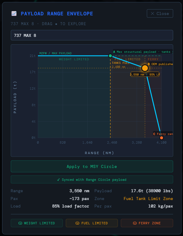
In Great Circle Pro, dragging the dot on the payload and range chart automatically updates the range circle on the map to reflect the selected operating point. Each drawn circle on the map stores its own independent payload setting, so you can compare how far the same widebody flies at 95% load factor versus 75% by drawing both circles from the same airport and seeing them side by side.
Freighters (A350F, 747 8F) get special handling: cargo is the payload, so the slider is anchored at 100% structural payload and the cargo toggle is locked on. The ring renders at the airframe's published max payload range by default. Corporate variants sit at the opposite end of the spectrum, with small VIP cabins and very low typical load factors. The model captures that distinction so corporate aircraft are not treated like airliners.
Airspace Avoidance
Since 2022, a meaningful share of long haul flying has been shaped less by geography than by which regions of airspace are actually overflyable. The Airspace toggle on the Flight Plan tool decides whether the tool draws routes through restricted regions or routes around them. Off draws the geometric great circle. On detours each route around current closed airspace and recalculates block time, fuel, range check, and CO2 against the detoured distance.
What is currently restricted
The curated regions as of 2026, grouped by how the router treats them. Closed zones are hard walls a route detours around; caution zones are drawn and flagged but not automatically detoured; a conditional zone is closed below an altitude floor and open above it.
- Russia (West and Far East segments), closed to many US, EU, UK, Canada, Japan, and Korea carriers since February 2022.
- Belarus, avoided by many Western carriers since June 2021.
- Ukraine FIR, active conflict zone with broad avoidance since February 2022.
- Libya, Yemen (Sanaa FIR), Sudan, and North Korea, closed for conflict or long standing risk.
- Lebanon and Kuwait, closed to overflights amid the 2026 Gulf escalation.
- Iran, western half, closed. Iran, eastern corridor, conditional: open only to aircraft cruising above FL285, so a jet may overfly while a turboprop is routed around.
- Iraq, Israel, Syria, and Afghanistan, caution: elevated risk, drawn and flagged but not an automatic detour.
Each entry is tracked against public aviation advisories and reviewed on a set cadence. Most entries move slowly, so the list is usually stable from one review to the next.
The detour output
When the Airspace toggle is on and a great circle route would cross a restricted region, the tool produces a planning grade detour around the affected area. Where a real world airline routing is known for the affected city pair, the detour follows that filed routing, so the shape reflects how the leg is actually flown. For pairs without a known routing, it draws an efficient estimate around the closure and labels it as an estimate. The block time, fuel, range check, and emissions on the Flight Plan card all use the detoured distance. The route card surfaces the detour with an amber chip listing the regions avoided and the distance and time added.
Polygon visualisation layer
When the Airspace toggle is on, the restricted polygons render as translucent red overlays with dashed boundaries, drawn on the map underneath the route lines. The colour is intentionally subdued so the polygons are visible but do not dominate the map; they answer the "what is being avoided" question without competing with the route geometry. With the toggle off, the layer is not rendered, so the default map stays clean.
What this is not
The polygons are simplified country and FIR outlines, built for route planning at the long haul scale this tool models. They are not exact airway boundaries. Real airline routes round corners differently, ride waypoints between airways, and sometimes accept tactical deviations that a planning model cannot predict. For operational dispatch use, refer to current NOTAMs and your operator's published procedures. For long term planning and the "what does my network look like with current closures" question, the tool's avoidance pattern is a strong approximation of what airlines actually file.
Map Projections
Seven map views are available, six true projections plus a street-level tile map, each with its own strengths:
- Natural Earth: A balanced pseudocylindrical projection and the best general purpose view for global route planning. It is the default for a reason.
- Mercator: Conformal cylindrical. Great circles appear as curves; rhumb lines appear straight. Area is heavily distorted at high latitudes, which makes Greenland look like it could swallow Africa. It cannot.
- Orthographic (Globe): True perspective view from space. Great circles appear as straight lines across the face of the globe. Drag to spin, scroll to zoom. Feels like looking out the window of the ISS if the ISS had better labeling.
- Azimuthal Equidistant: All distances from the projection centre are true scale. Range circles appear as perfect circles. Auto centres on your selected airport. This is the projection to use for hub network planning.
- Equal Earth: Equal area pseudocylindrical. Landmass sizes are proportionally accurate, which is useful for comparing oceanic coverage regions where you need honest area comparisons.
- Patterson: A cylindrical projection that keeps the whole world in a clean rectangle with gentler polar stretching than Mercator. A good familiar rectangular view when you want a full world map without Mercator's extreme high latitude distortion.
Related Pages
Explore the complete feature list, browse the aircraft range & specs database, or read our deeper guide to aircraft range circles. For definitions of aviation terms used here, see the FAQ & glossary.