Boeing 787-9 Range Circles: Anchorage vs Houston
Take one Boeing 787-9 and draw its range circle from two very different airports, hot and low Houston and cold, high-latitude Anchorage, then read off the numbers. On a normal day the two circles are almost identical, exactly what you would expect from the same airplane. But under cautious planning the result flips in a way most people do not expect: the circle from freezing Anchorage comes out larger than the one from steamy Houston. Here is why.
One Airplane, Two Opposite Airports
The Boeing 787-9 Dreamliner is one of the airplanes airlines reach for when a route is long and thin: a transpacific leg, a polar hop, a city pair that only fills a couple hundred seats a day. Its whole job is to fly a long way while burning as little fuel as possible. So a natural planning question is simple to ask and surprisingly slippery to answer: how far can it actually go? The honest answer is that it depends almost as much on where it takes off as on the airplane.
To see that, we drew the same 787-9 from two deliberately opposite airports and read off the circles. Boeing publishes a typical 787-9 range of about 7,565 nautical miles, and that single still-air number is the same wherever the airplane sits. What changes, once you stop treating the brochure figure as a route plan, is how much usable range each airport lets you keep.
Why these two airports? Houston (IAH), George Bush Intercontinental, and Anchorage (ANC) are a deliberately extreme pair. Houston sits low on the hot, humid Gulf Coast, a major long-haul gateway where summer afternoons turn genuinely hot. Anchorage is high-latitude, cold, and a legendary long-haul and cargo crossroads. Drawing the same airplane from both is the cleanest way to see how much the airport itself, not just the airframe, shapes the circle.
Normal Ops vs Conservative Planning
Start with the normal-ops view: climatological average winds, a typical day, the setting a planner reaches for first. Drawn this way, here is the mean reach of the 787-9 from each airport (the average radius around the field).
| Boeing 787-9 (normal ops) | From Houston (IAH) | From Anchorage (ANC) |
|---|---|---|
| Mean reach | about 7,190 nm | about 7,210 nm |
Almost a dead heat: Anchorage edges Houston by only about 20 nm, well inside the noise. That is exactly what intuition predicts. It is the same airplane and the same brochure range, so on an average day the two circles sit nearly on top of each other. If this were the only view you ever drew, you would conclude the airport barely matters.
Now switch to the conservative planning view, adverse winds plus a hot-day temperature allowance, the cautious setting a planner uses when the question is "can we always make it," not "can we make it on a good day." Both circles pull in, but they do not pull in by the same amount.
| Boeing 787-9 (conservative) | From Houston (IAH) | From Anchorage (ANC) |
|---|---|---|
| Mean reach | about 6,860 nm | about 7,015 nm |
There it is. Under cautious planning the same 787-9 draws about 7,015 nm from Anchorage but only about 6,860 nm from Houston, a gap of roughly 155 nm, and it is the cold airport that comes out ahead. The freezing field draws the larger guaranteed-reach circle. That is the opposite of what most people expect, and it is worth slowing down for.
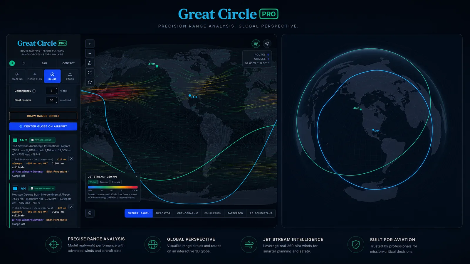
Same Jet, Two Very Different Airports
The instinct is that an airplane is an airplane: a 787-9 should reach the same distance no matter where it starts. The range circle says otherwise, and not because of the airframe. The difference between the Houston circle and the Anchorage circle for the identical aircraft comes almost entirely from the air around the airport and the winds the jet meets on the way out.
In the normal-ops view, the two airports are nearly a wash. It is the conservative view, the one that bakes in a hot-day allowance, where they separate, and Anchorage pulls ahead by roughly 155 nm. The airport, in other words, is doing the talking, and the thing it is saying is all about temperature.
The Hot-Day Surprise: Why Cold Anchorage Can Out-Reach Hot Houston
Here is the centerpiece, stated plainly. Under conservative planning, the 787-9 draws about 7,015 nm from Anchorage versus about 6,860 nm from Houston. The freezing airport beats the warm one by over 150 nm, with the identical airplane. How can cold win?
It comes down to what heat does to an airplane. Hot air is thin air. When the temperature climbs well above standard, the air molecules spread out, and a thinner atmosphere is harder to fly in efficiently. Two things happen, and both cost range. First, the climb gets expensive: the engines and wings have less dense air to work with, so the airplane burns more fuel clawing its way up to cruise. Second, the airplane often cannot climb as high, or as quickly, to its most efficient cruise altitude, so it spends more of the flight lower down where the jet drinks more fuel per mile. Add those up and a genuinely hot departure quietly shaves real distance off the range circle.
Now put that penalty on a map. The hot-day allowance bites hardest where hot days are actually hot, and subtropical Houston is exactly that kind of place. Anchorage, sitting at high latitude with cool air most of the year, barely feels the same allowance. So when you ask both airports the cautious question, Houston gives back a chunk of range to the heat while Anchorage keeps almost all of its own. The hot-day penalty in Houston is large enough to more than cancel out any small wind advantage it had, and the circle from cold Anchorage ends up the bigger of the two.
The takeaway in one line: a hot Houston day costs an airliner more range than a cold Anchorage day, and the difference is big enough to flip which airport draws the larger guaranteed-reach circle. It is a vivid reminder that the airport's climate is a real input to range, not a footnote.
This is also why the effect only shows up in the conservative view. The normal-ops setting uses average winds and does not lean on the hot-day allowance, so the two airports look almost identical there. It is precisely the cautious, plan-for-the-worst setting, the one that adds the temperature margin, that surfaces the gap. If you only ever draw the optimistic circle, you would never notice that Houston is quietly the more range-limited airport of the two.
Round or Directional: Two Honest Ways to Draw a Circle
All the numbers so far have been a single mean radius, one number summarizing the whole ring. But the moment wind enters the picture, a range circle is never a perfect ring. There are two equally valid ways to draw it, and Great Circle Pro lets you see both.
The first is a near-round conservative footprint: a tidy, almost-circular envelope that answers "can we reliably reach it in any direction." This is the safe planning shape, the one you want when a destination has to be inside the circle no matter which way the wind is blowing that day.
The second is a directional shape (the optimistic, tailwind-credited picture) that bulges downwind and pinches upwind, because a tailwind carries the airplane farther and a headwind holds it back. This is the more mission-realistic view: it shows how far the jet actually reaches depending on which heading it flies. The spread between the two ends can be substantial.
| Directional reach (conservative) | Upwind end | Downwind end | Swing |
|---|---|---|---|
| 787-9 from Houston | about 6,180 nm | about 7,850 nm | about 1,670 nm |
| 787-9 from Anchorage | about 6,800 nm | about 7,590 nm | about 790 nm |
From Houston, the 787-9's directional circle swings by roughly 1,670 nm between flying with the wind and flying against it: well over a thousand miles of difference depending purely on heading. From Anchorage the swing is tighter, around 790 nm, because Houston's mid-latitude routes ride the strong, consistent jet stream both ways, while Anchorage's high-latitude routes average over weaker, more variable winds. Same airplane, two airports, but the directional picture tells you something the single mean number cannot: a route that looks marginal on the upwind side might be comfortably in reach downwind, and vice versa. Neither drawing is "more correct." The round footprint is the safe envelope; the directional shape is the realistic one. Pick the one that matches the question you are asking.
How Cautious Do You Want to Be? 50%, 85%, and Tailwinds Off
A range circle is only ever as honest as the assumptions behind it, and the real value of drawing it yourself is that you decide how much margin goes in. Great Circle Pro gives you more than one dial for that.
The first is the wind percentile. At the 50th percentile you get the everyday circle: average winds for the season, the picture you draw to ask "can we make this on a normal day." Switch to the 85th percentile and the model leans on a strong-wind day, the kind that is only beaten a small fraction of the time, which is exactly the adverse-wind margin a dispatcher plans to when the answer has to hold up rather than merely usually work. That one switch is what separated hot Houston from cold Anchorage earlier in this post, because the 85th-percentile setting also folds in the hot-day temperature allowance.
The second dial is the tailwind credit, and the key is that it only governs the upside. Leave it on and a tailwind is allowed to extend the reach, so the ring bulges downwind into the egg that shows how far the jet actually carries the airplane on a favorable heading. Turn it off and no heading earns that bonus: the downwind reach is held at the still-air number. What does not change either way is the headwind side. A headwind always pulls the ring inward, in both modes, because flying into the wind genuinely costs you distance. That asymmetry is the point: tailwind credit off is not a neutral circle, it is a still-air envelope with its upwind edge dented in by the strongest winds along the route, so the binding constraint is always the least favorable direction, never the average one. Stack the cautious ends of both dials, 85th-percentile winds, the hot-day temperature allowance, and no tailwind credit, and you arrive at the floor case: the smallest, most defensible circle the tool will draw, and the honest answer to the "can we always make it, on a bad day and in the wrong direction" question that high-level network planning actually turns on.
The Jet Stream, by Season
Every circle in the tool is drawn over the wind that shaped it, and that wind is not a static arrow. Great Circle Pro animates the real 250 hPa flow as thousands of moving streaks, coloured by speed from calm blues up through 120-knot-plus reds, so you can see at a glance where the jet is roaring and where the air is quiet.
Switch between Winter, Summer, and Average and the whole field redraws. The Northern Hemisphere winter jet is a different animal from the summer one: the North Pacific core that pins Anchorage's range can top 130 knots in January and fade to roughly half that by July. South of the subtropics the trade winds run the other way, steady easterlies, and the model resolves all of it from the equator to the poles, blending smoothly between regimes so a circle drawn out of Singapore looks nothing like one drawn out of Anchorage. The Average mode splits the difference for an annual planning view.
Because each bearing reads the wind along its entire route rather than just the air over the airport, flipping the season genuinely reshapes the circle, not only the backdrop. Drawing the 787-9 from Anchorage in winter versus summer is the quickest way to feel how much a single airport's reach rides on the calendar, and why a network planner cannot treat "range" as one fixed number.
Settings to Play With
The numbers in this article are just one slice. The whole point of drawing these circles yourself is that every knob changes the shape, and the differences are easy to feel once you start sliding things around. A few worth exploring:
- Payload slider. A lighter airplane flies farther. Drag the load down and watch both circles grow; push it up toward a denser cabin and they shrink. This is the single biggest lever you control.
- Cargo toggle. Brochure ranges are quoted at passengers and bags only. Switch belly freight on and the circle pulls in, because that cargo is weight the airplane has to carry instead of fuel.
- Reserves toggle. Published ranges already bake in dispatch reserves and contingency fuel. The reserves control lets you see how the picture shifts when you account for that margin differently.
- Wind percentile. This is the normal-ops versus conservative switch that drove the whole hot-day surprise above. Average winds give you the everyday circle; the cautious setting adds adverse winds and the hot-day allowance that separates Houston from Anchorage.
The most useful exercise is the one we did not do for you: draw the 787-9 from your home airport, flip between the normal and conservative views, and see whether your field behaves more like hot Houston or cool Anchorage. The answer says as much about your local climate as it does about the airplane.
A note on the numbers. Everything here is a planning estimate rounded to sensible precision, not certified performance data. Real dispatch involves step climbs, cost-index speeds, actual loaded weights, oceanic track constraints, and the day's real weather. Nobody files a flight from a browser tool, and we are not pretending otherwise. These circles are built to compare airplanes and airports honestly, not to release a flight.